I’m a curious frontend developer. When making my way through the World Wide Web—either because I myself am the user of a product or while doing a UX audit—I often find odd stuff in user interfaces (UIs) that make me think. Then naturally, I want to know what’s going on and why things are not working as expected.
In this article, I am going to
- share some of these user interface bugs and inconsistencies I discovered recently,
- explain what the problem is (spoiler: most of the time, it’s broken HTML),
- and how it could (and should) be fixed.
At the end, I’d like to share my thoughts about how these bugs could be prevented in the first place; we’ll have a look at what it takes to keep a frontend codebase maintainable and enjoyable to work with for years to come.
Three wonderfully weird issues
The following examples are all taken from production sites, but I won’t disclose the original source. After all, this article should not be about pointing out bad code but about ideas how to write better and maintainable frontend code. Let’s get started!
Button-links and link-buttons
I had to use a form that included three buttons at the end: "Cancel", "Add another" and "Save". All looked very similar, but the middle button was slightly larger than the others and had a different font size.
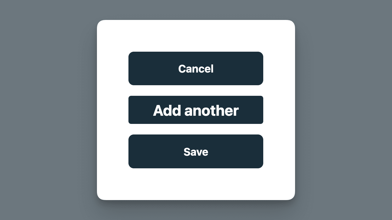
As always in such situations, I opened the browser’s developer tools, and there I found the following code (please note that I’ve simplified the code snippets in this article to only show the things I want to talk about):
<button type="submit" class="btn-blue">Cancel</button>
<a href="#" class="btn-blue addButton">Add another</a>
<button type="button" class="btn-blue">Save</button>
Interestingly, the button with the label "Cancel" has the type="submit" attribute. 🤔 The middle button is a link with no href attribute but an attached event listener that triggers an action: it opens a modal. 🫠 All three buttons use the same .btn-blue class, so they share basic button styles and all of them are blue. The .addButton class attached some extra styles to the middle button.
What made me think here:
- The wrong button is used to submit the form.
- The link element should actually be another button, because an action and not a navigation is triggered when clicking it.
- The link element has slightly different styles, so it looks a bit off compared to the other two buttons. Just applying the same class to different HTML elements does not necessarily make them look alike, because as in this example, links and buttons have different user agent styles. If these are not fully reset, buttons and link-buttons can look different, even if they are based on the same CSS class.
All problems can be solved by fixing the wrong HTML code:
<button type="reset" class="btn-blue">Cancel</button>
<button type="button" class="btn-blue">Add another</button>
<button type="submit" class="btn-blue">Save</button>
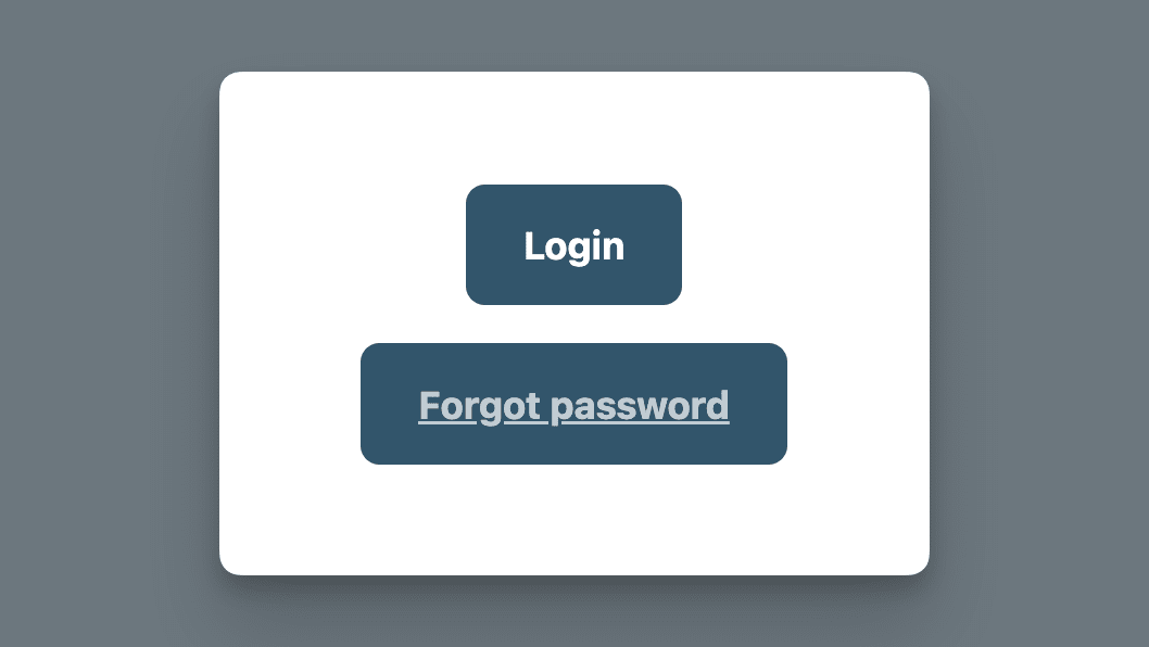
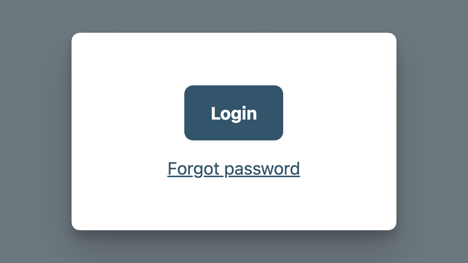
I had a similar issue in a login form. The button labeled "Login" was next to a button including underlined text with a different text color saying "Forgot password." The latter led to another page. It was underlined because the underlying HTML element was a link (i.e. an <a>-Element) and the text decoration was not reset.
User interface tips:
- Use buttons to trigger actions and use links to navigate to another page. It’s just that simple. 🙌
- Additionally, make the difference clear for the user and use well-known interface patterns: buttons are usually a text label placed on a colored background or surrounded by some padding and a border; links are often blue and underlined and thus distinguishable from other text elements.
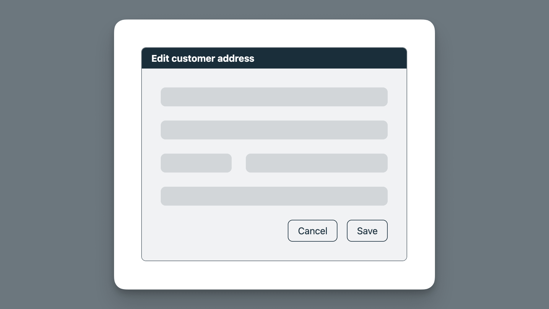
Dialog footer inconsistencies
In a project I’m currently working on, we use a lot of dialogs containing text-only information or forms. According to our design system, a dialog needs to follow a specific structure. Each dialog consists of:
- a header bar with a title and a close button,
- the dialog content,
- and, in case there are available actions, a footer section including some buttons.
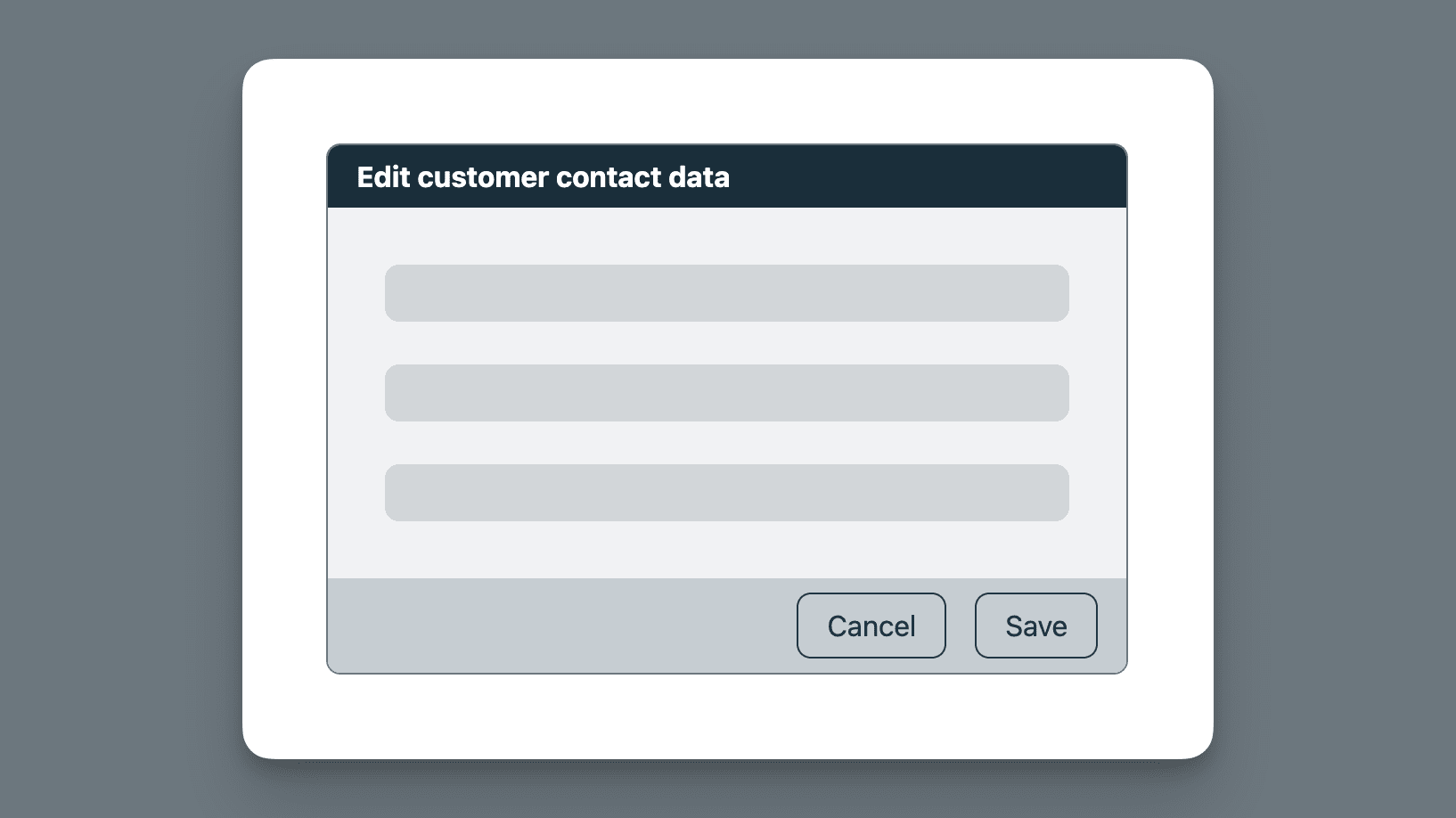
The code has the following structure (again, this is only an example without all the details):
<dialog>
  <DialogHeader> Edit customer contact data </DialogHeader>
  <DialogContent>
    <!-- some form fields -->
  </DialogContent>
  <DialogActions>
    <DialogButton>Cancel</DialogButton>
    <DialogButton>Save</DialogButton>
  </DialogActions>
</dialog>
When working on some styling improvements, I found a dialog where the form’s cancel and submit buttons were placed in the content area and not the footer… 🤔
As it turned out, the reason was that by using the desired form validation pattern, it was not possible to structure the markup in a way that the footer styles were applied. The style guidelines from the design system were ignored due to technical constraints.
<dialog>
  <DialogHeader> Edit customer contact data </DialogHeader>
  <DialogContent>
    <EditForm>
      <!-- some form fields -->
      <CancelButton>Cancel</CancelButton>
      <SubmitButton>Submit</SubmitButton>
    </EditForm>
  </DialogContent>
</dialog>
Due to how the EditForm component works, the buttons need to be placed inside the DialogContent, so there’s no way to use the DialogActions component, which provides the desired styling.
We solved the problem by re-evaluating the requirements for dialogs, especially when the content is a form, more specifically, an EditForm. The solution was to create a custom component that made it possible to place the form fields and the buttons in the same container element (required for form validation); dedicated styling was used to visually align this dialog with the others. 🙌
Unstyled interactive states
When doing a UX audit recently, I found suspicious behavior in the application’s side navigation. At first glance, the navigation items all looked the same: an icon next to some text. When I started interacting with the nav items, I realized that for some items, the hover state was different/missing.
Naturally, I instantly opened the browser’s developer tools and dug deeper… 🧐
And behold, I found the most complex and broken HTML code for a simple navigation entry I’ve seen to date:
<nav>
  <!-- more nav items -->
  <div class="card">
    <button class="nav-btn">
      <a href="/settings">
        <label for="navItemTitle">
          <i class="settings-icon"></i>
          <span id="navItemTitle">Settings</span>
        </label>
      </a>
    </button>
  </div>
  <div class="nav-link">
    <i class="contact-icon"></i>
    <span>Contact</span>
  </div>
  <!-- more nav items -->
</nav>
There’s a lot to unpack here. I won’t go into all the details, because that’s not the point of this article, but here’s a list of really broken things:
- A link should not be nested inside a button.
- A label should be used to add a description to a form control. Here someone presumably tried to label the icon, which is not necessary because the text ("Settings") is already the accessible name of the anchor element.
- A navigation item should be a link and not a generic div element with some JavaScript event listeners.
After I got access to the codebase, I found out that the link nested inside a button resulted from the combination of different components: the "Settings" link is not only a link to the settings page but also toggles an accordion containing subitems. A NavItem (the link) was placed inside an AccordionHeader (the button).
The great (and bad) thing about the web is: the code shown above still works, even if it is both semantically and syntactically wrong. 🥲 This is a reason why fixing stuff like this usually has a low priority—why should we invest in something that already gets the job done?
Now, let’s get to the point!
Common and repeated problems
We know that no project is perfect and bad code just happens for different reasons. What I’m interested in is what all these examples have in common and how we can avoid the problems mentioned above. What does it need to write better frontend code?
My experience taught me that a broken UI is often the result of (at least one of) the following:
- invalid HTML code
- too much CSS code (not using inheritance or the cascade, just overriding existing styles to "fix" things)
- HTML elements are not used as intended
- no shared design tokens and/or documented design patterns exist
- when design tokens and/or patterns (a.k.a. a "design system") are available, they are not used (as intended)
- when a (third-party) component library is used, components are not used as intended
- broken code was copied from somewhere else in the codebase
- last but not least: some developers just don’t see and/or acknowledge the resulting UI problems
How can we do better?
First of all: get familiar with the basics! Yes, I mean, the very basics like:
- What HTML elements are there and what is their functionality?
- What is accessibility and why should I care?
- How does CSS really work? (What layout algorithms are there, what is the cascade, how does inheritance work,…)
- Do I (still) need JavaScript to achieve a certain behavior, or are there (already) HTML and CSS features that can do the job; maybe even better?
- Become familiar with some general design basics and universal best practices.
Don’t know where to start? I wrote a web development basics tutorial that might be interesting for you… 😊
Why using a framework and a component library alone is not the solution
All the projects mentioned above have something in common: they use a UI framework together with a design system—either an existing, third-party component library like Material UI, Syncfusion, Bootstrap or similar, or at least some shared styles in the form of a set of reusable CSS classes.
Unfortunately, this alone does not help to make a website or application work and keep a consistent look and feel. Creating a user interface is not just dragging and dropping UI components from a library into the codebase or applying CSS classes to HTML elements. The components and classes used must play well together and be used as intended.
What is the solution then…? Glad you asked!
How to build great UIs that last
Not all teams are big enough to have their own (UX) designers or dedicated frontend developers, but maybe "just" some full-stack developers who need to juggle all the new feature requests and important bug fixes in a pinch.
Here are my personal learnings how we can—with a little bit of knowledge and extra effort—still build great UIs and avoid nasty inconsistencies and technical debt on the frontend:
- Create small composable components for repetitive UI code.
- Alternatively, use a third-party component/utility library.
- Document when to use which components in what variants. Especially when using an extensive third-party design system, not all components or variants thereof might be suitable for your product, so narrow it down—create a design system of the design system.
- Create a dedicated area within the product to collect all these components and code snippets. You don’t need to build an entire design system, but the goal should be to have a place developers can refer to when they build something new (we all love copying and pasting, don’t we? 😉).
- When you find a (small) UI bug: fix it as soon as you find it! (think like a boy/girl scout 💪)
- When you find old and outdated code: refactor it!
- Take your time to update your project’s dependencies regularly! Otherwise, one day, when things start to fall apart, it can be overwhelming to take care of all the outdated and deprecated parts of your codebase.
- Document important design decisions in a place where they can be found easily (e.g., in a Wiki, not buried in GitHub discussions or Slack channels 🙈).
- Bonus: when you’re the frontend/UX expert of your team, do regular UI workshops with all developers:
- present the most used components and how they should and should not be used
- talk about design system updates
- review recent issues and pull requests related to UI bugs and show the team what could be improved and how
At scale, we've worked on many different types of projects already, small and large codebases alike; the problems tend to always be the same, the discussions similar, the solutions familiar. Investing time in writing good code now is going to save much more time and money down the road. Having a maintained codebase makes development more fun. 🤩 New features can be added more easily, bugs can be prevented from happening, and, best of all, the product’s users have a better experience—a win-win-win situation! 🎉
Let us know if you’re interested in our work or just want to chat! You can reach us at hello@scale.at and find us on Mastodon.