Today’s tutorial covers one of the newer features in CSS: custom properties, also often referred to as CSS variables, which might be a bit misleading, because they can do much more than just being a placeholder for a certain value. There are many elegant and creative use cases for custom properties which cannot all be covered in this post, so I’m going to link a few additional articles at the end for further reading.
We are going to use custom properties to build a dark theme for our small website. Let’s get started!
Defining and using custom properties
The basics first: custom properties start with two dashes (--) followed by a name of your choice. Note that they are case-sensitive! They need to be defined within a CSS rule:
section {
  --text-color: #202020;
}
Now, within each <section> element the --text-color can be accessed by using the var() function:
p {
  color: var(--text-color);
}
Note that this only works for paragraphs (<p>) that are nested within a section element (<section>). This is how custom properties can be scoped to certain elements.
To make sure that we also set a color (other than the inherited color) for all the other paragraphs, we can provide a fallback like so:
p {
  color: var(--text-color, #333333);
}
More interesting facts about custom properties, the cascade, and fallbacks can be found in:
- Custom properties and fallbacks by Manuel Matuzović
- CSS Custom Properties Fail Without Fallback by Matthias Ott
- CSS custom properties and the cascade by Jeremy Keith
- Appendix: Why didn’t we just use the cascade? by Lea Verou
We don't want to dig deeper just now—let’s start using custom properties in our little website project.
Setting up design tokens
One use case of CSS custom properties is so-called “design tokens” of a project. In this case, they actually work like variables we know from other programming languages: we assign a value to a name and can then access this value by using the name later in the code. We’re now going to make a list of all tiny building blocks when it comes to our website design, including:
- colors
- spacings
- fonts
Let’s open our CSS file and look for all the values we can find there. Remember, this is part of a tutorial series. You can either start from the beginning, or have a look at the repository on GitHub, containing the code from this one and previous parts of the tutorial.
Often, you see people placing properties that should be globally available within the :root pseudo-class selector, which selects the root element of our web page.
:root {
	/* global custom properties here */
}
We could also use the html type selector (the difference is the specificity of these two selectors) or the body selector. The important thing is, that our design tokens can be accessed from all elements on the page.
Naming things
Naming things is hard. How to find good names for our custom properties? I suggest to describe the function or meaning of a certain value and use, for example, --font-family-body-text instead of --font-family-sans-serif or --main-color instead of --purple. It’s similar to naming CSS classes. We should rather use .error-text instead of .red-text and avoid describing the style in the name. This way, we stay flexible and are prepared for future updates and redesigns. 😎
Colors
Let’s start with creating a small color palette at the top of our CSS file…
:root {
  --text-color: #303030;
  --text-color-light: #ffffff;
  --background-color: #fafafa;
  --background-color-variant: #f0f0f0;

  --main-color: indigo;
  --main-color-dark: #3c2a4a;

  --hover-color: darkmagenta;

  --accent-color: darkcyan;
  --border-color: lightgray;
}
…and replace all occurrences with the newly defined custom properties:
body {
 color: var(--text-color);
 background-color: var(--background-color);
}

a {
 color: var(--accent-color);
}

/* and so on… */
Fonts and spacings
Additionally, I add custom properties for fonts and spacing values:
:root {
  /* color tokens */

  --body-font: "Helvetica", "Arial", sans-serif;
  --heading-font: "Georgia", "Times", serif;

  --spacing-1: 8px;
  --spacing-1_5: 12px;
  --spacing-2: 16px;
  --spacing-3: 24px;
  --spacing-4: 32px;

  --border-radius: 4px;
}
In the CSS code below, I update all properties. Here’s an example:
h1, h2, h3 {
  color: var(--main-color);
  font-family: var(--heading-font);
}

.main-nav {
  padding-block-start: var(--spacing-2);
  padding-block-end: var(--spacing-2);
  border-bottom: 1px solid var(--border-color);
  padding: var(--spacing-2) var(--spacing-3);
  gap: var(--spacing-2);
}
In some places, I’ve used 20px as value. To be more consistent, I update these to var(--spacing-3).
Check out the repository on GitHub, which contains the full code of this tutorial series. Go to repository.
Creating a dark theme
Now, the fun part starts!
The plan is to add colors for a dark themed site and display it to the user based on their preferred color-scheme settings.
Picking colors isn’t an easy task. Depending on the size of the project, it’s a lot of work for a designer to choose perfect matching colors in different shades as well as accessible color combinations. Gladly, on our small website, there are not that many colors that need to be transformed. Here’s how I would approach this.
Colors for background and body text
I start with updating the background color(s) and the body text color. I choose the dark gray text color of my light theme as background (#303030) and the light gray background as text color (#fafafa). For the sections with a different background color, I choose another dark gray, which is a bit brighter than the main background color (#404040).
In a second CSS rule (we talk about this in a moment) with the :root selector, I add the three new colors.
:root {
  --text-color: #fafafa;
  --background-color: #303030;
  --background-color-variant: #404040;
}
When I open the about page in the browser, this is what it currently looks like.
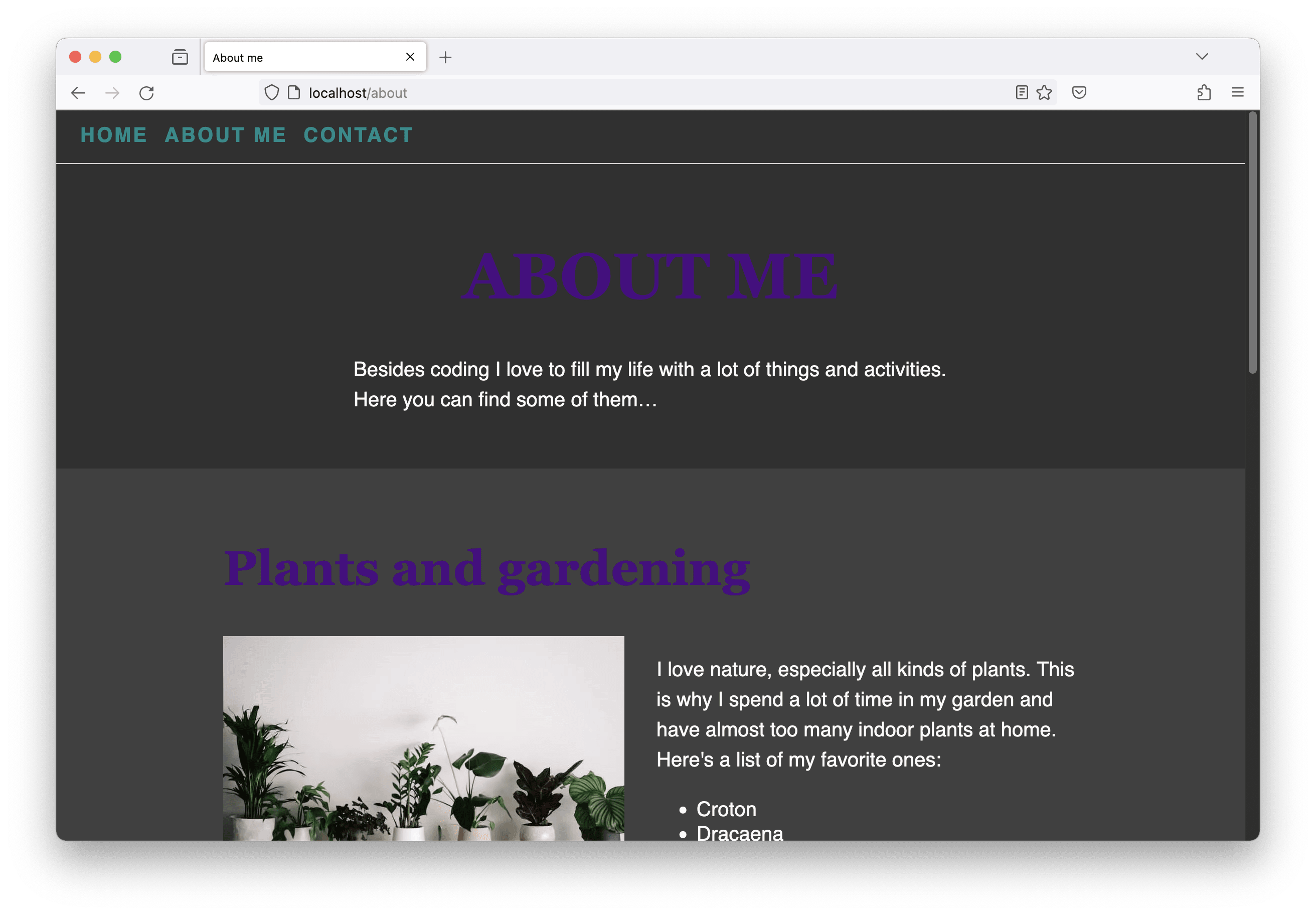
Updating headlines and links
As you can (hopefully?) see in the screenshot above, the colors of the navigation links and headlines don’t look good on the dark background. For the next steps, I switch browsers and open the page in Chrome, because its developer tools provide great accessibility features.
When we inspect the headline, we get this little tooltip including accessibility information. What catches my eye is the contrast of text to background color, which is too low.

Actually, I didn’t need the developer tools telling me that. But stay with me… 😉
In the “Styles” tab in the developer tools, I can click on the little square representing the current element’s color to open a color picker. There again is the information about the color contrast, which can be expanded.

When expanded, two lines become visible, indicating the color thresholds to meet either the contrast required by WCAG level AA or AAA.
I play around a bit and finally choose #c37ef5 as main color for the dark theme. I do the same for the accent color and update the border color as well to something slightly darker.
:root {
  /* text and background colors */

  --main-color: #c37ef5;
  --accent-color: #00aaaa;
  --border-color: #818181;
}
Improve the form design
Overall, everything looks quite nice already. When I have a closer look at the contact page and specifically the form itself, I find two problems:
- The hover color used for the input borders on hover can hardly be seen on the dark background.
- The white button label color doesn’t work well on the brighter main color background.
I don’t want to change the color values I already chose, because they work fine in all other places. So I need to introduce new custom properties:
--input-hover-border-color--button-hover-background-color--button-text-color--button-hover-text-color
I update my light theme design tokens (using the first :root CSS rule) as follows:
:root {
  /* color tokens */

  --input-hover-border-color: var(--hover-color);
  --button-hover-background-color: var(--hover-color);
  --button-text-color: var(--text-color-light);
  --button-hover-text-color: var(--text-color-light);
}
This is how I would use the colors in the dark theme (adding them to the second :root CSS rule):
:root {
  /* color tokens */

  --input-hover-border-color: var(--accent-color);
  --button-hover-background-color: var(--hover-color);
  --button-text-color: #303030;
  --button-hover-text-color: var(--text-color);
}
And here are the updated CSS rules, using the newly created custom properties:
.contact-form input:hover,
.contact-form textarea:hover {
  border-color: var(--input-hover-border-color);
}

.contact-form [type="submit"] {
  /* other styles */
  border-color: var(--main-color);
  background-color: var(--main-color);
  color: var(--button-text-color);
}

.contact-form [type="submit"]:hover {
  border-color: var(--button-hover-background-color);
  background-color: var(--button-hover-background-color);
  color: var(--button-hover-text-color);
}
Loading the dark theme
Currently, we have two :root CSS rule blocks in our CSS code. On top the one with the light theme custom properties as well as font families and spacing tokens, below the updated colors for our dark theme.
The thing with CSS and the cascade is, that properties that come later in the code as part of a rule with a selector with the same specificity override those that came before. This is why our website now only uses the dark theme values.
However, we only want to activate the dark theme when the user has this preference turned on…
Here’s where media queries come into play again. We’ve used them already for changing the layout based on the available viewport size. Additionally, there are also media features available we can use to target specific user settings. In our case, we need the prefers-color-scheme feature and update our CSS code as follows:
:root {
  /* light theme and spacing design tokens */
}

@media (prefers-color-scheme: dark) {
  :root {
    /* dark theme color tokens */
  }
}
Once you update the code and reload the webpage in the browser, you can see the light or dark theme, depending on what’s your current setting.
Toggle dark and light theme during development
During development, I don’t want to change the general settings of my operating system just to have a look at the different color modes. Fortunately, the browser’s developer tools provide a great way of doing exactly this.
In Chrome, click on the three dots in the top right corner to open a menu, navigate to the “More tools” entry and click “Rendering”. A new section is opened showing a lot of different rendering settings. Scroll down a bit and find the entry called “Emulate CSS media feature prefers-color-scheme”. There you can now toggle between the light and the dark theme.


But wait, there's more!
This was a short introduction about CSS custom properties and one way they can be used to create a dark theme combined with a CSS media query.
On CodePen, I created another small example showing how theming can be achieved using custom properties.
There’s much more custom properties can be used for and there are lots of interesting resources out there you should definitely check out in case you think, that this is a great CSS feature to learn more about:
- Using CSS custom properties on MDN
- CSS Variables 101 by Ahmad Shadeed
- Beyond CSS Variables (talk) by Miriam Suzanne
- Custom properties with defaults: 3+1 strategies by Lea Verou