The term “responsive web design” was coined in 2010 by Ethan Marcotte in an article of the same name. When the first smartphones were used to access the World Wide Web, developers suddenly had to find a way to make websites look good not only on larger screens, but on small ones as well.
Nowadays, responsive web design is not only about different screen sizes, but user preferences in general (e.g. the preferred color scheme) or responsiveness on a component level as described by Una Kravets in her post about “the new responsive”. In this article we are going to focus on the adaptation to different screen sizes.
By default—without adding any custom CSS—a webpage is perfectly responsive. Take the code from the tutorial where we’ve built a tiny website, open the website in a browser and start resizing the window. You will realize that the text adapts to the window size and each word is readable at any screen size.
As soon as we start building more complex layouts using modern CSS techniques and overriding the defaults, some more lines of code are required to make the design adapt perfectly to any viewport imaginable.
Small screens first
When this whole responsive web design topic came up, websites optimized for larger screens needed to be downsized for the smaller screen sizes of the first smartphones. The default was always the “desktop version” of a site or application. Often in product development processes nowadays, the designer still starts creating the version of the product for large screens, with all of its bells and whistles. You know, the one that looks super fancy and helps the project manager sell the product. 🤑
Sadly, the version for smaller screen sizes doesn’t get that much attention and love, if any at all. In the worst case, the developer doesn’t get an adjusted design at all—and this in a time when most traffic on the world wide web comes from smartphones and mobile devices.
When you start by designing and implementing the small screen version first you get the following benefits:
- You are forced to reduce and focus on the most important content. You are limited to single-column layouts and must decide what to put on top and prioritize.
- Single-column layouts can easily be built with HTML and (almost no) CSS. This doesn’t require any fancy tricks and is usually easier than anything else.
- Building a single-column layout answers questions about source order in HTML. When the source order matches the visual order, users navigating the page with their keyboard (amongst others) will thank you.
- It’s always easier to add visual elements and content later than to remove it once it’s already there.
- CSS code initially written for small screens with enhancements for more complex layouts on top is easier to read, understand and maintain. During the development process, it’s smoother to add styles than to reset them to their default value. Remember, HTML without any CSS has been invented for presenting information to the user in a readable and responsive way by default.
Tools to build a responsive website
Let’s dig into the coding part again and discuss some CSS and HTML features to create a great user experience for small, medium and large screen devices alike.
Responsive design in five steps
My approach to build a responsive website or application is the following:
- Optimize the design for small screens.
- Enhance the layout for larger screen sizes based on the content and the space the content needs.
- Choose font sizes that work well on the respective screen size.
- Use HTML to load images in the appropriate size (and format) to improve performance.
- Test your website on different devices.
Techniques to create responsive layouts
CSS and HTML offer a lot of features you can use (separately or in combination) to build your project:
- Media queries to target different screen sizes
- Advanced CSS layout modes like flexible box, grid, or multi-column layout
- Relative length units based on the current viewport size like
vw(viewport width) orvh(viewport height) - CSS Functions like
min(),max(), orclamp() - Attributes for the
imgtag for responsive images to provide the optimal image for the current device
From theory to practice
We’re now going to enhance our small example website with some responsive design features. Let’s first look at wireframes that define how the pages should be structured on small and large screens.


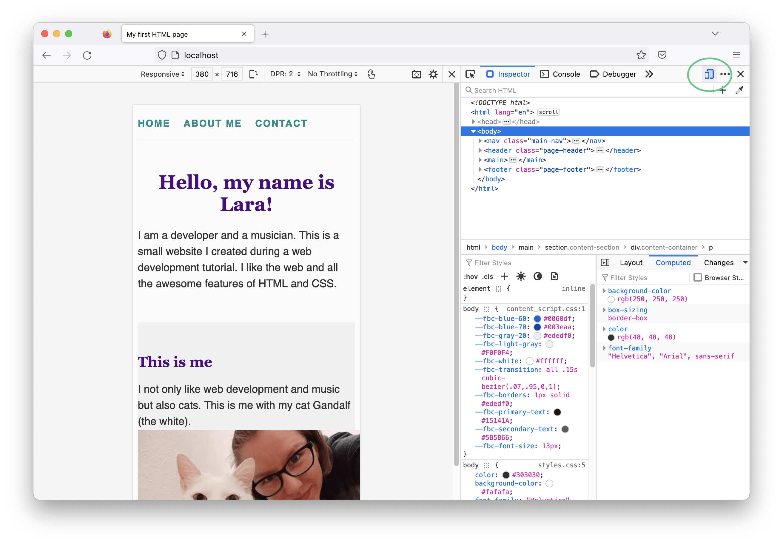
As mentioned above, I prefer implementing the small-screen design first and build the advanced layouts on top of that. Let’s open the index file of our example website in a code editor and a browser. 🧑💻 In the browser, we open the developer tools and click the “toggle device toolbar” button in Chrome or the “responsive design mode” button in Firefox. This way we get a view where we can resize the viewport without affecting the rest of the browser panes. I set the viewport width to approximately 380-400 px and switch to the code editor.
Adjusting boxes
When looking at the website’s homepage in the browser, we can spot the first design imperfections:
- there are small white gaps between the sections having a gray background and the edges of the viewport
- the image is too wide for its containing section, which makes the page horizontally scrollable
- the content spans from the left to the right edge of the content sections without any room to breathe
Let’s fix them! 🛠️
The small white gaps are caused by the user agent styles setting an 8px margin for the body.

This makes perfect sense for web pages that don’t provide any custom CSS, but in our case, we want to override this. Add the following line to the existing CSS rule:
body {
  /* styles from previous tutorials */
  margin: 0;
}
Images are by default displayed in the file’s original dimensions. In my case, I added an image that is 400 pixels wide. Once the screen gets smaller than that, the image doesn’t have enough space anymore and grows out of its containing element—this is called overflow.

Consequently, one line of CSS code that can be found in all my web projects is the following:
img {
  max-width: 100%;
}
This way, I limit the width of all images to the width of the containing element’s content area. By the way, this “trick” is part of a longer list called Defensive CSS by Ahmad Shadeed, which you should definitely bookmark and read later.
Finally, we’d like to provide more space between the viewport edges and the website content, so we need to add some padding to the navigation and the content sections. I update my CSS code as follows:
.main-nav {
  /* styles from previous tutorials */
  /* the following line replaces the padding-block-start and padding-block-end properties we set last time */
  padding: 16px 24px;
}

.content-container {
  /* styles from previous tutorials */
  padding: 0 24px;
}
As described last time when talking about the CSS box model, I used shorthand properties for the padding. The first value is the padding for top and bottom, this means in block direction, and the second one is the padding for the inline direction. Note, that the value for the inline-padding is the same for the navigation and the content container. This way, the text is aligned and the page looks tidied up. 🧹

The viewport meta tag
Before we are going to add responsive styles, we need to add an important piece of information to our HTML pages’ <head>: the viewport meta tag.
<meta name="viewport" content="width=device-width, initial-scale=1" />
This way we tell the browser that the viewport width should be treated as the device width and initially the content should not be scaled. Why do we need that, you might ask… When the first smartphone capable of accessing the World Wide Web was released, we didn’t have the techniques to provide styles targeting these devices yet. Therefore, the mobile browser took the website and scaled it down in a way the content fits in the available viewport, so that it’s still accessible and doesn’t break. The font sizes got so small they were barely readable and the user needed to zoom in and scroll in all directions to access the whole page.
As we are going to take care of small screen sizes soon, we override this behavior by adding the viewport meta tag, and we’re good to go.
The full code of this article can be found on GitHub. Go to repository.
A responsive navigation using flexible box layout
As seen in the wireframe above, the navigation should be in one column on small screens and in one row on large screens. Currently the nav consists of several inline elements, so the items sit next to each other (in inline direction) and when there’s not enough space in one line, the content breaks into two or more, depending on the amount of entries.
A CSS layout mode we can use here to achieve our goal is the flexible box layout or often just called flexbox for short. It’s a layout mode that perfectly uses the available space to place the content items in one direction—a row or a column.
To switch from our default “flow layout” to “flexbox”, we add the following to our CSS code:
.main-nav {
  display: flex;
}
What happens is that the navigation becomes a flex container and its direct children—the links—become flex items. The default direction of a flex layout is row, but in our design for small screens we want the navigation items to stack on top of each other in a column.
.main-nav {
  display: flex;
  flex-direction: column;
}
Last time, we added spacings between the items using the margin-inline-end property for the nav links. For the layout we’re building now, we need some space between the items in column direction. This could be achieved with margins in combination with flexbox layout, but there’s a more elegant way to provide space between the items when using this layout mode. Let’s remove the nav items’ margin completely and add the gap property to our flex container instead. This defines empty space between the flex items, either in row or column direction, depending on the current flexbox settings.
.main-nav {
  display: flex;
  flex-direction: column;
  gap: 16px;
}
Yay, we built our first small micro layout using CSS flexbox! 🎉 Use the browser’s developer tools to have a closer look again. You can click the “flex” button next to the nav element in the Inspector tab in Firefox (the same feature exists in Chrome dev tools as well) and the browser visualizes the flex-container, its items and the gap.

Next, we enhance the styles to have our items sit in one row again, but only when there’s enough horizontal space. I’d say, a viewport width of 600px and up provides enough space to switch from a column- to a row-layout in our example. To define this so-called breakpoint in our CSS code, we need a CSS media query.
Media queries
Media queries are a combination of features that either evaluate to true or false. When all given features are true, the code inside the block following the media query is applied. This looks as follows for our example:
@media screen and (min-width: 600px) {
  .main-nav {
    flex-direction: row;
  }
}
This code block wrapped by the media query is put below the rule above, so it comes later in the CSS code and is applied when the media query evaluates to true, which is the case for all screens displaying a viewport larger than 599px. Within the CSS rule we override the previous value for flex-direction, all other properties set for the .main-nav stay the same.
Switch to your browser and resize the website’s viewport to see this piece of code and our first responsive layout in action. When the width is 600px or larger, the navigation layout “jumps” from a single column layout to one row. Note that the gap changes its position automatically, depending on the value of flex-direction, which is nicer than working with margins. Hooray! 🥳
Text next to an image
A very common UI element in websites is a section containing an image next to some text. We could use the same idea from our navigation layout from above to build this: on smaller screens we only have space for a single column layout, on larger screens the image should sit next to the text.


To build this layout, we move to the about page of our website where we already have some text content. We add a third content section and add an image to each section. You can use any image you like or just a dummy image for now. I found some nice ones at Unsplash—a great resource for free stock photos.
For the single column layout, we’d like the image to sit on top of the text block, so we’re going to structure the HTML code like that.
<section class="content-section">
  <div class="content-container">
    <h2>Books and reading</h2>
    <img src="images/about-books.jpg" alt="The corner of my living room with a filled bookshelf." />
    <p>
      Reading is another activity I enjoy to calm down after a long work day. I have many books at home, because I prefer “real books” compared to e-books. I love the smell of new books and sometimes make notes on pages.
    </p>
  </div>
</section>
On small screens, the layout is already done—that’s the great thing about this “mobile first approach” when building websites.
In order to create the two-column layout on larger screens, a few code adjustments are required:
- We need a wrapper around the image and the paragraph, that will become our flex container element. This can be a
divelement, because we only need this for additional styling but not for any additional semantic meaning. - When there’s more than one paragraph for the text, we also need to group these child elements, because we want to handle the text as a single flex item.
- We probably must update the current content container’s maximum width. Last time we chose a value that works well with text-only columns, but as we’re introducing a two-column layout, we need more horizontal space.
This is my updated HTML code for one of the content sections.
<section class="content-section">
  <div class="content-container content-container-wide">
    <h2>Plants and gardening</h2>
    <div class="text-and-image-block">
      <img src="images/about-plants.jpg" alt="Some green plants on a sideboard." />
      <div class="text">
        <p>
          I love nature, especially all kinds of plants. This is why I spend a lot of time in my garden and have almost too many indoor plants at home. Here's a list of my favorite ones:
        </p>
        <ul>
          <!-- some list items -->
        </ul>
      </div>
    </div>
  </div>
</section>
Note that I added:
- an additional class
content-container-wide - an additional div with the class
text-and-image-block, which will be our flex container - an additional div to group the text content with the class
text
Now let’s get to the fun part, the CSS code!
The wide content container should have a maximum width of 900px instead of the 640px we set on the normal content container, so I add the following rule to my CSS file below the .content-container class selector, because I want this styling to override the previous one:
.content-container { /* some other styles */ }

.content-container-wide {
  max-width: 900px;
}
When we reach a certain viewport size and we have enough space, we want:
- the text-and-image-block to use a two-column layout
- the image to have a maximum width of 400px
This is the required CSS code:
@media screen and (min-width: 800px) {
  .text-and-image-block {
    display: flex;
    gap: 32px;
  }

  .text-and-image-block img {
    max-width: 400px;
  }
}
You can play around with the values for the gap, the max-width, or the media query breakpoint and adjust them as you like.
Changing the visual order
There are several ways that allow us to change the visual order of elements with flexbox. We can either use the order property or change the value of flex-direction to row-reverse or column-reverse.
In our example, we want to alternate the layout, so that in every second section on larger screens the image and text elements switch sides.
@media screen and (min-width: 800px) {
  /* the code from above */

  .content-section:nth-child(even) .text-and-image-block {
    flex-direction: row-reverse;
  }
}
I use the flex-direction property, because there will always only be two child elements in my flex container. The :nth-child pseudo class allows me to select every second section in my CSS code.
The final result looks like this:

Please note that you always need to be careful when changing the visual order of elements in a way that it doesn’t match the order of HTML elements in the code anymore. Especially when the content contains focusable elements, this can lead to confusion when navigating through the site using the keyboard. In our example, this is okay, because it doesn’t matter whether the user consumes the image or the text first (e.g. when using a screen reader).
For a more detailed article about the behavior of the flexible box layout and all its features, I can highly recommend reading the interactive guide to flexbox by Josh W. Comeau.
Fluid typography
Fluid design is all about responsive design without the need of media queries. This is possible by using CSS units that are relative to the current viewport size, for example:
vw– 1% of the viewport widthvh– 1% of the viewport height
We can use these units to adjust the font size of our website in a way that we use very large characters on wider screens, but adjust the font size accordingly for smaller devices to avoid horizontal scrollbars or cut-off text. (Headlines and font sizes being too large for the available space is something I often find when surfing the web with my smartphone—and it really annoys me… 🙈)
Accessible typography
Before adjusting the font sizes on our web page, I’d like to highlight one typography-related accessibility issue: We should avoid defining the font size of an element by using absolute values like pixels—especially on the html element—but rather use relative units like rem or %. The reason is that a user with impaired vision may want to increase the base font size in the browser (which is usually 16px by default). When we override this with absolute values in our CSS code, the user’s preferences are overridden. 😢 However, when using relative units, the texts on our page adjust relatively to the base font size the user defined. 🤩
I’d like the font size of my example website to be slightly larger than the default 16px, but instead of adding font-size: 20px to my root element, I choose to use a relative value:
html {
  font-size: 125%;
}
For other elements on the page, e.g. headlines, I use the rem unit, which is always relative to the root font size—the one defined in the html rule (in our case, 125% of the browser default or the user’s own settings). I adjust the CSS code of my example page as follows:
h1 {
  font-size: 3.2rem;
}

h2 {
  font-size: 2.4rem;
}

h3 {
  font-size: 2rem;
}

.page-footer p {
  /* replace the 14px with: */
  font-size: 0.875rem;
}
Fluid headlines
Now we have these large, bold headlines that look nice on large displays, but which can lead to problems on devices with smaller screens.

In the following screenshot, the site title takes up too much space compared to the rest of the content.

A CSS feature we can use to adjust the font size to our viewport size is the clamp() function. It is not only used for fluid typography but for fluid designs in general and takes three values:
- a minimum value
- a preferred value
- a maximum value
This can look as follows: clamp(1rem, 2vw, 3rem), i.e. the property should have the value of 2% of the viewport’s width but not shrink below 1rem and not grow above 3rem (which would be 48px in case the root font size is set to 16px).
I came up with the following font sizes for my headlines using the fixed values I had before as maximum values:
h1 {
  font-size: clamp(1.9rem, 6vw, 3.2rem);
}

h2 {
  font-size: clamp(1.6rem, 5vw, 2.4rem);
}

h3 {
  font-size: clamp(1.3rem, 4vw, 2rem);
}
Take a couple of minutes and play around with the CSS code in the browser using the developer tools and find values that look good to you and match your design.
The problem we now have (again) is that when the preferred value is applied, we don’t have a reference to the root font size anymore, so user preferences are not taken into account here… 🤯
As you can imagine, fluid typography can get more complicated than what we’ve discussed in our example. If you want to dig deeper into more details, more math, and more accessibility, have a look at Modern fluid typography using CSS clamp by Adrian Bece on Smashing Magazine.
When it comes to typography, you can use font scales that provide perfectly balanced font sizes for headings and body text. There are tools out there that help you with defining these scales, for example type-scale.com by Jeremy Church or Utopia by James Gilyead and Trys Mudford for fluid font scales.
Another article that describes a few topics we’ve already covered, as well as additional interesting facts about web design and typography, is 5 Keys to accessible web typography by Matej Latin.
Concluding thoughts
I’d like to round off this article with two additional thoughts:
When it comes to layout, I try to avoid talking about specific devices like smartphones or laptops; for instance, a user may open two browser windows side-by-side, so the “mobile design” will be applied for users working on a large-screen device as well.
Also, I try not to define a set of fixed breakpoints in my projects (unless I’m working with an existing design system) but let the content define them. The times where we had three different screen sizes (an iPhone, an iPad, and everything above)—and thus three breakpoints optimized for exactly these devices’ viewports—is long over.
Summary and outlook
To stop this article from getting too long, I decided to split it into several upcoming articles. This time, you got a general idea about what responsive design is and how it can be used to adjust your web design to a variety of screen sizes using media queries and fluid typography based on the current viewport size. We’ve learned about a new CSS layout mode: CSS flexible box layout and how to use it in combination with media queries. But that’s just the beginning…
I’m looking forward to the next parts where we are going to create a layout for the contact form using CSS grid. We will also learn about responsive images soon. Stay tuned!