The main and most important part of websites, I’d say, is good text content, followed by images. Adding an image to a webpage is easy using the img tag as follows:
<img src="/path/to/image.jpg"
     alt="A description of what can be seen on the image." />
We use the src attribute to tell the browser where to find the image and the alt attribute to add alternative text in case the image cannot be displayed or the user needs a textual description of the image content (e.g. using a screen reader).
Remember that the image element has no content and therefore no closing tag is needed here. The tag’s end slash is optional, but in some of my projects (e.g. React + JSX) the coding style requires this slash, so I’m accustomed to adding it.
Images and accessibility
I can’t stress this enough: always add descriptive alternative text to images (that contain informative content) to support users who are not able to perceive the images with their eyes but use, for example, an assistive technology like a screen reader.
When the image is just decorative, don’t just skip the alt attribute, but use an empty string as its value:
<img src="/assets/images/background-pattern.png"
     alt="" />
This way it’s made clear that the image doesn’t convey any important information and can be ignored by assistive technology. A missing alt attribute is considered bad practice and should be avoided.
New attributes: srcset and sizes
On the about page of our little website we’ve added some images in the last tutorial part about responsive web design. On small screens the image takes up almost the full width of the page and on larger screens, when we switch to the two-column layout, there is a line in the CSS code limiting the image’s width to 400px.
@media screen and (min-width: 800px) {
  .text-and-image-block img {
    max-width: 400px;
  }
}
Check out the repository on GitHub, which contains the full code of this tutorial series. Go to repository.
Now, every time we request the page, the linked images are loaded in their full size. What if the image files are much larger than required for the space they occupy on the webpage? Well, then the user needs to load more data than required and this can slow down the page. This is something we want to avoid, and we can do this using only HTML! 🎉
Let me introduce: the srcset and sizes attributes.
First, we need to prepare our content, which means providing files of the same picture in different sizes. I’ll go with nine image versions, starting at 400px and ending at 2000px width, increasing each image by 200px width. All images are saved to the images folder in my project folder. To tell the browser about these nine image versions, we need to add the srcset attribute to the img tag:
<img src="images/about-books-1000.jpg"
     srcset="images/about-books-400.jpg 400w, images/about-books-600.jpg 600w, images/about-books-800.jpg 800w, images/about-books-1000.jpg 1000w, images/about-books-1200.jpg 1200w, images/about-books-1400.jpg 1400w, images/about-books-1600.jpg 1600w, images/about-books-1800.jpg 1800w, images/about-books-2000.jpg 2000w"
     alt="The corner of my living room with a filled bookshelf." />
The value of the attribute is a list of image paths followed by a space and the image’s width in pixels, e.g. 800w (not 800px!), separated by commas.
I keep the src attribute as fallback and use a medium width image of 1000px here.
The browser now has a set of images to choose from. But how to decide which image to load? That’s where the sizes attribute comes in. The value of this attribute is used to tell the browser how large the image is rendered based on the website design. In our case, this looks as follows: sizes="(min-width: 800px) 400px, 95vw". This looks somehow familiar, as it’s part of our CSS code. Once the viewport width is 800px or larger, we limit the image’s width to 400px. On smaller screen sizes, the image takes up approximately 95% of the viewport width (because there’s some padding left and right).
The final version of the img element looks as follows:
<img src="images/about-books-1000.jpg"
     srcset="images/about-books-400.jpg 400w, images/about-books-600.jpg 600w, images/about-books-800.jpg 800w, images/about-books-1000.jpg 1000w, images/about-books-1200.jpg 1200w, images/about-books-1400.jpg 1400w, images/about-books-1600.jpg 1600w, images/about-books-1800.jpg 1800w, images/about-books-2000.jpg 2000w"
     sizes="(min-width: 800px) 400px, 95vw"
     alt="The corner of my living room with a filled bookshelf." />
I update the code of all three images on the about page the same way.
The full code of this article can be found on GitHub. Go to the code of the about page.
Responsive images in 2026
You might have been thinking that coming up with a good value for sizes is somehow cumbersome… you are not alone! A lot has happened on the web since I wrote this article, and now it’s time for a little update.
The problem is: in order for the browser to decide which image to load from the srcset, it must have an idea about how large the image is going to be. All the CSS and layouting magic happens after a request is sent to load the images, so we need(ed) this workaround of defining sizes and somehow repeat code we’ve already written in CSS.
Images that are not visible on the initial page load don’t need to be fetched from the server right from the start. To handle this, add the loading="lazy" attribute to your img tag. Now, the browser loads the page and does all the layouting before images somewhere down the page are visible. Now, the browser knows exactly how large the image will be rendered once loaded! 😎 The job left on our side is to add sizes="auto" to the image and let the browser handle the rest.
What a time to be alive!
Note that at the time of writing, this is not yet supported in all major browsers. But the web is great and offers ways to provide progressively enhanced code. Just add auto before the current value of sizes and you’re good to go. Browsers that don’t know what auto does just ignore it and behave the same as before.
<img src="images/about-books-1000.jpg"
     srcset="..."
     sizes="auto, (min-width: 800px) 400px, 95vw"
     alt="The corner of my living room with a filled bookshelf." />
Check out this article by Mat Marquis about the end of responsive images for more details.
Debugging in the browser
Once our code is updated, we want to know whether this actually works in the browser. So, let’s open the about page in Firefox or Chrome and check out what’s happening using the developer tools.

First, I set the viewport size of the page to 600px and inspect the image. With this setting, the image takes up 552x368px of space on the webpage, so the next largest version should be loaded (which is the file with 600px width in our case) to perfectly fill the available space without the image getting scaled up and blurry.
I navigate to the “Network” tab in the developer tools, clear all entries, filter by “Images” and reload the page. There, I can see that three images with a width of 1200px have been loaded – but why? 🤔
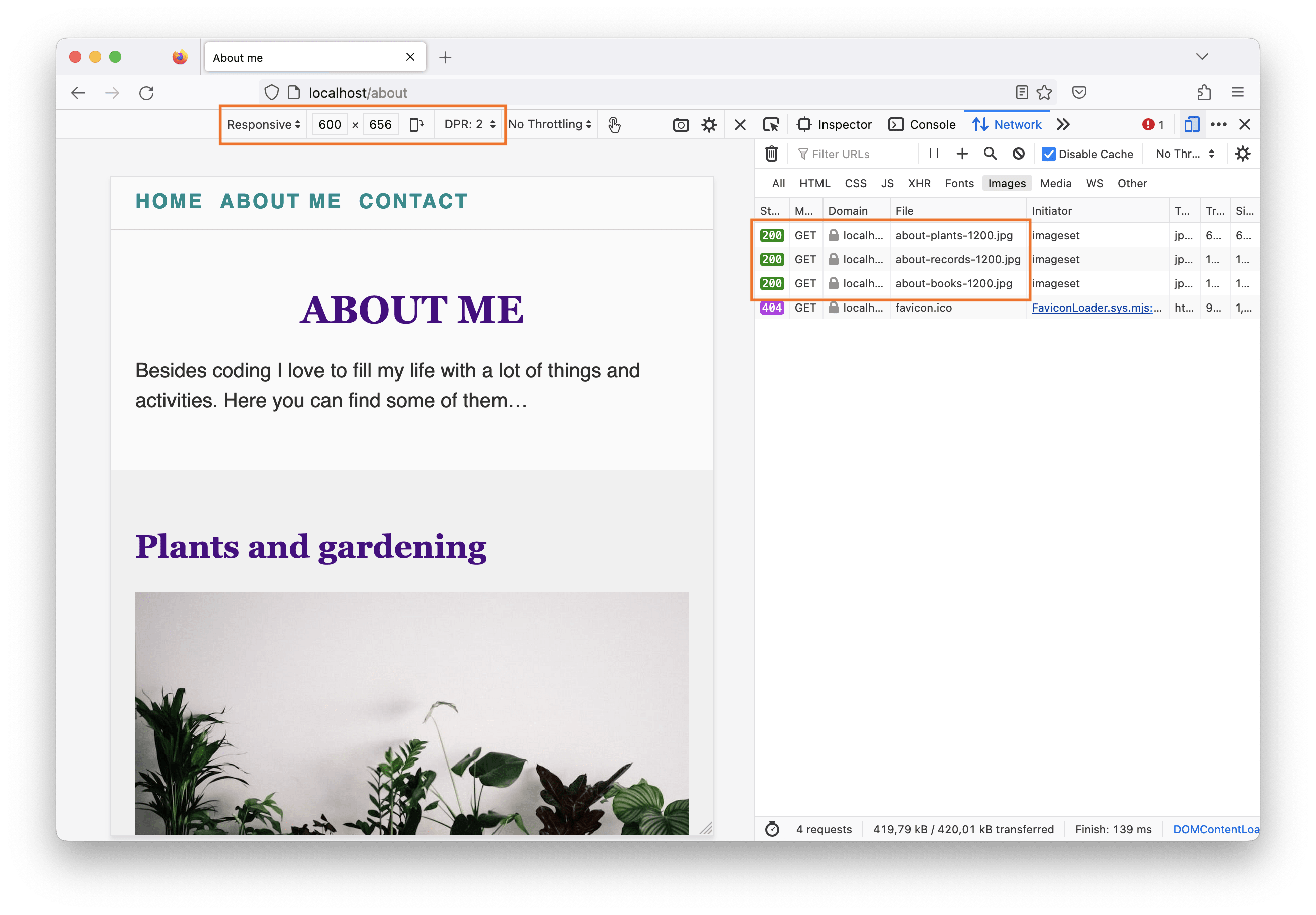
The reason is one setting in the developer tools we didn’t yet talk about: the device pixel ratio (DPR), which is currently set to 2. Switch the value to 1 and reload the page. Then repeat the steps described above and check the “Network” tab again. Now the 600px wide images are loaded.

For devices with a higher pixel density, larger images are required to fill the available space without the images getting blurry, because for a DPR of 2 an area of one pixel in CSS is equal to an area of four pixels on the screen. Thus, we need an image twice the width. 🧮
Let’s set the DPR back to 2 and resize the viewport to 1000px. The page now uses the two-column layout where the image size is limited to 400px. Due to the DPR setting, the 800px wide images are loaded.
Note that in Chrome, once a larger version of the image has already been loaded, the browser does not load a smaller version when the viewport is resized, because a larger image always perfectly fills the small space (but not the other way round). This doesn’t seem to be the case in Firefox, as I just found out. 🙃
Image file formats and performance
Using HTML only, we can optimize the performance of our webpage, which is great! Additionally, we should make sure to reduce the file sizes of our image assets using tools like e.g. Squoosh.
A couple of years ago, new image file formats (AVIF, WebP) were introduced. They provide a better compression than e.g. JPG, but are/were not supported in all browsers. We can still make use of the benefits of these file types and provide fallbacks for older browsers by using the picture element. Using new(er) features but still support old(er) browsers is called "progressive enhancement". Here’s an example:
<picture>
  <source srcset="/path/to/image.avif" type="image/avif" />
  <source srcset="/path/to/image.webp" type="image/webp" />
  <img src="/path/to/image.jpg" alt="..." />
</picture>
The picture element contains one or more source elements with different versions of the same image in different file formats. When the browser cannot work with AVIF, it falls back to WebP or JPG in case WebP is not supported either. This can also be combined with the srcset and sizes attributes described above.
The img element is required as child element for features like adding an alternative text or a class for styling and other attributes.
So, we started with <img src="images/about-books.jpg" alt="The corner of my living room with a filled bookshelf." /> and here’s the final code for one of the three images on the about page:
<picture>
    <source
      srcset="images/webp/about-books-400.webp 400w, images/webp/about-books-600.webp 600w, images/webp/about-books-800.webp 800w, images/webp/about-books-1000.webp 1000w, images/webp/about-books-1200.webp 1200w, images/webp/about-books-1400.webp 1400w, images/webp/about-books-1600.webp 1600w, images/webp/about-books-1800.webp 1800w, images/webp/about-books-2000.webp 2000w"
      sizes="(min-width: 800px) 400px, 95vw"
      type="image/webp" />
    <source
      srcset="images/about-books-400.jpg 400w, images/about-books-600.jpg 600w, images/about-books-800.jpg 800w, images/about-books-1000.jpg 1000w, images/about-books-1200.jpg 1200w, images/about-books-1400.jpg 1400w, images/about-books-1600.jpg 1600w, images/about-books-1800.jpg 1800w, images/about-books-2000.jpg 2000w"
      sizes="(min-width: 800px) 400px, 95vw"
      type="image/jpeg" />
    <img src="images/about-books-1000.jpg" alt="The corner of my living room with a filled bookshelf." />
</picture>
The picture element for art direction
Another great feature the picture element provides is the possibility to load a completely different image based on a media condition. Let’s say we want to have a wide image with a reduced height on small screens and a square image in our two-column layout…
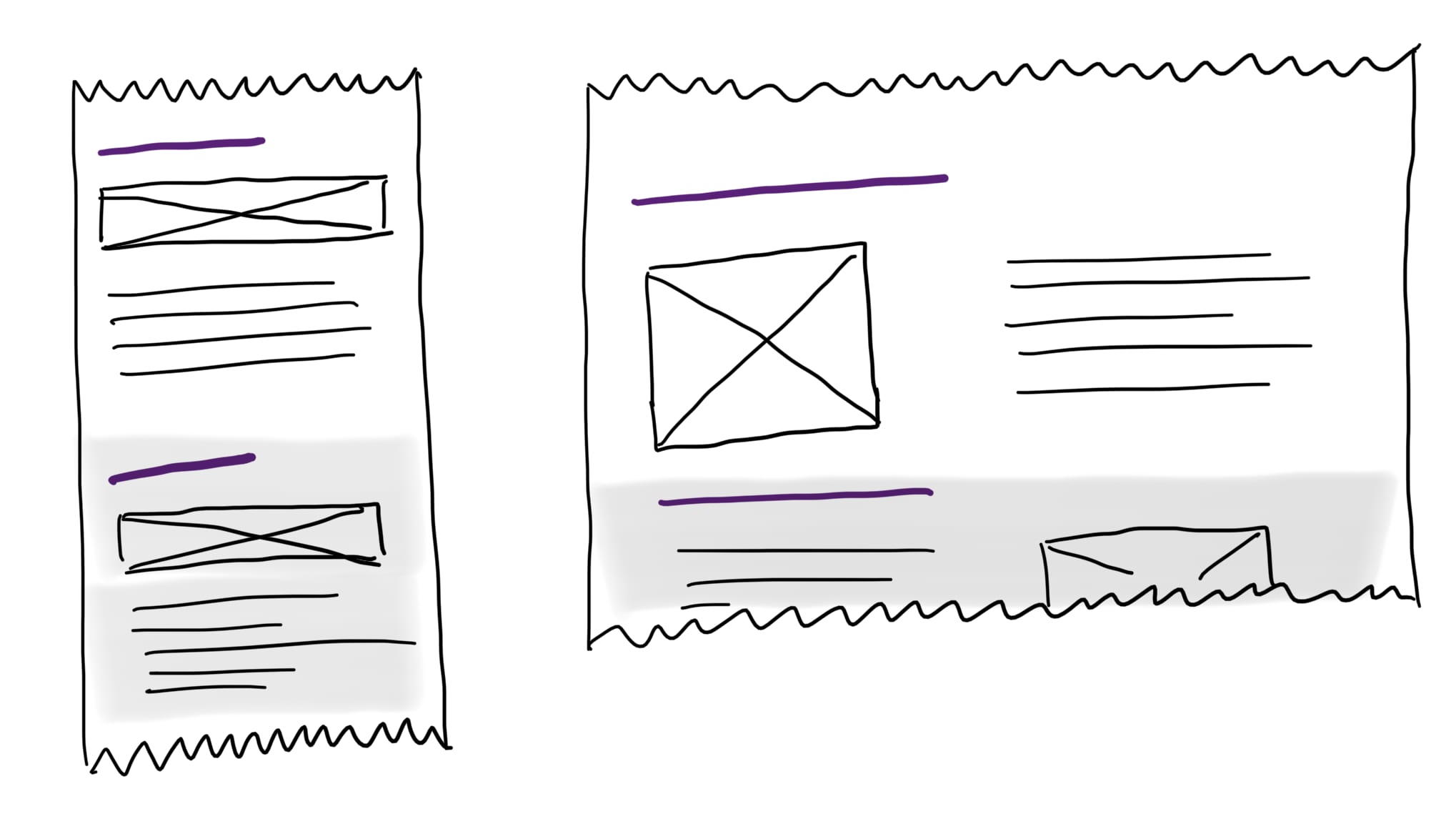
Here is the code we would need for a design like that:
<picture>
  <source srcset="images/about-books-square.jpg" media="(min-width: 800px)" />
  <source srcset="images/about-books-wide.jpg" />
  <img src="images/about-books-1000.jpg" alt="The corner of my living room with a filled bookshelf." />
</picture>
Here’s what the page would look like on a 650px wide viewport:

On the following screenshot you can see a part of the page on a 850px wide viewport, which is greater than 800px, so the square image is loaded.

Depending on what you like more, you can either choose the one or the other layout for your webpage. The code snippet from above can be combined with the srcset and sizes example, which results in art direction combined with performance optimization. 🤩
Further reading
We were just scratching the surface of the power and feature set that HTML (and CSS) offer when it comes to responsive images. If you’re interested in more details, have a look at the following articles:
- Responsive images on MDN
- A Guide to the Responsive Images Syntax in HTML by Chris Coyier on CSS Tricks
- Responsive images on web.dev which contains a lot of additional information regarding image sizing, image loading and background images.
This was a small tutorial focussing on HTML only, but as you know, I’m a huge CSS fan, so next time we’re going to explore a super cool CSS feature to make our code even more exciting: CSS custom properties 😍 — in the meantime, check out our new profile on Mastodon and let us know if there are any open questions or content suggestions regarding the web development basics tutorial series!