The last part of my web development basics tutorial series was about selectors and their specificity, a very important topic about the inner workings of CSS. Today we’re going to continue with building our small personal website. In case you’re new here, I recommend going through the other articles of this series first since we’re always building on top of the code from last time. If you want to skip the previous articles, check out the GitHub repository containing the example code from last time.
In this article, we are going to talk about the CSS box model, learn a few more CSS properties you’ll often need, and start building a basic layout for our website.
Don’t think outside the box

On a webpage, every element is a rectangular box. Each box consists of four parts:
- content,
- padding,
- border, and
- margin.

Most boxes always have content, which can be child elements or the text within an element. We work with elements and their content since we started learning HTML. The properties padding, border, and margin can be set and modified via CSS. These are properties we need to define spacing between elements—the first step on our way to building a page layout.
Not all boxes are treated the same in CSS. There’s a difference between "block boxes" and "inline boxes".
Block boxes
We already know some ”block boxes” or “block elements”: headlines and paragraphs, navs, headers, and footers. When you add a block element to your page, it starts in its own new line and fills all the available horizontal space.
Each block element sits below the previous block element. Elements are stacked in block direction—by default, that’s from top to bottom. (We can change the default block direction, but this isn’t something we’re going to discuss today…)
Inline boxes
“Inline boxes” or “inline elements” sit next to each other in one line. Links, images, and labels are examples for inline elements. When you write text and there are parts you want to highlight with a strong tag, the text continues in the same line (but the meaning and styling of the content between the opening and closing tags changes)—this is because the strong element is an inline element and thus does not cause a line break.
An inline box grows depending on its content. It gets large enough to fit all its content inside.
The CSS box model in action
The reason we are talking about block and inline boxes (or elements) separately is that changing their padding, border, or margin properties behaves differently. Let’s have a look at these elements in the browser’s developer tools.
Open the index.html file in the browser and inspect the first headline element. In the screenshot below (I’m using Firefox) you can see the box of the first h1 headline: the blue area is the element’s content and the yellow areas above and below are the top and bottom margins. We can also name them margin-block-start and margin-block-end as our block direction goes from top to bottom.

As you can see in the bottom right corner of the screenshot where you find all the CSS code, there’s user agent styling (we talked about these styles in the CSS basics blog post some time ago) that sets the margin values to 0.67em. The developer tools come with an additional representation of the selected element’s box model; pause here, take some minutes and play around with it—change values and see what happens to the headline in the browser.
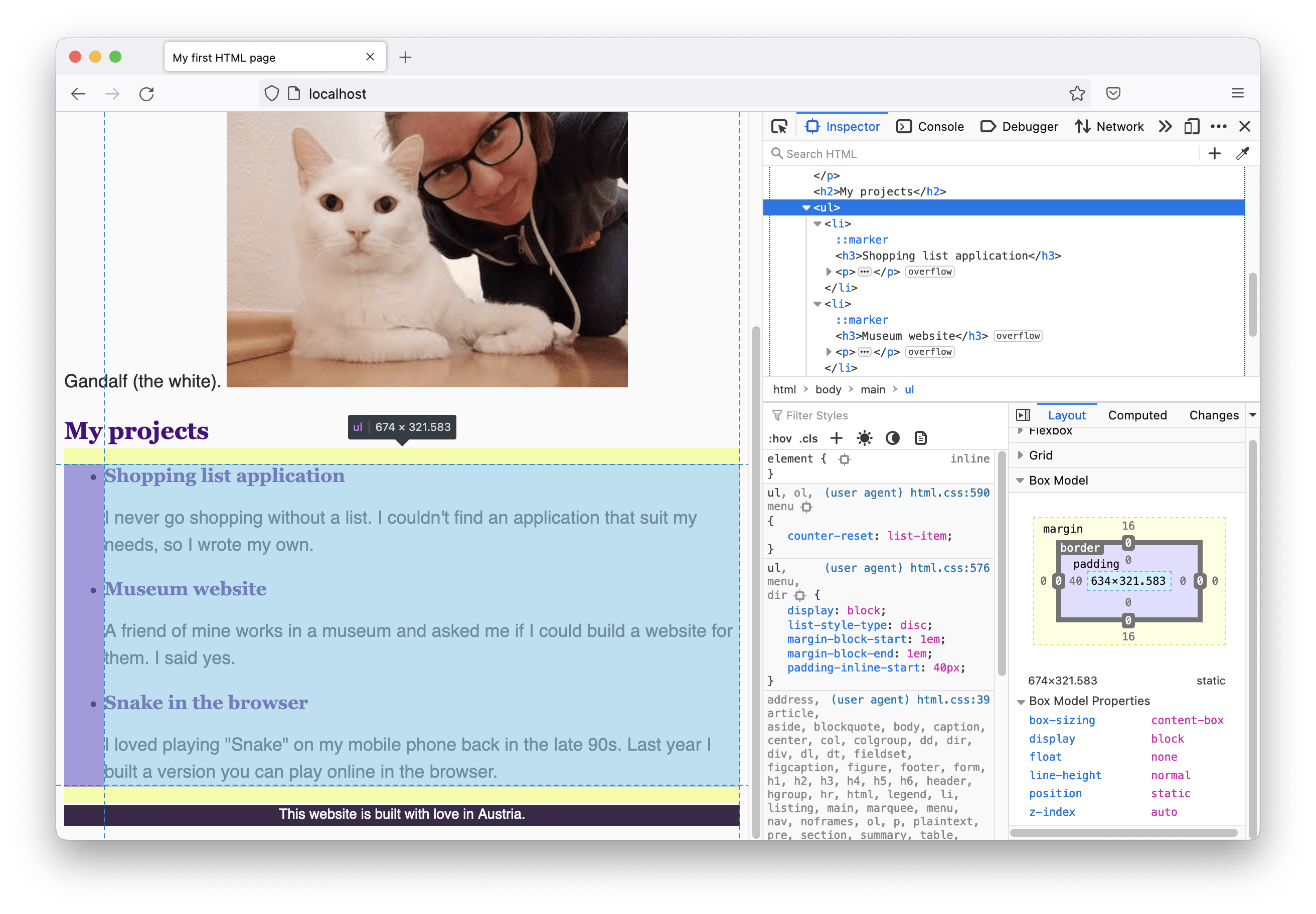
In the following screenshot, I selected the list (ul) further down below on the page. It not only has margins by default but a padding (the purple area) on the left of 40px. Another way to name this property is padding-inline-start because it’s at the start of the element seen in inline direction. If we don’t change the direction of the block and inline axes, the inline direction goes from left to right, so padding-left equals padding-inline-start.
We have control over all these properties of our box model: the size of the content, margins, paddings, and the border.
In the next part of this tutorial, we are going to make use of this power and start changing the default user agent styles and build a nice layout for our website.
Creating a layout: first steps
Building a website layout means defining and tweaking the size of your content areas and the space in between and define positions where each element should be placed on the page. In CSS, there are different layout modes—seven to be precise. The default layout mode is called “flow layout”, this is what we are working with right now.
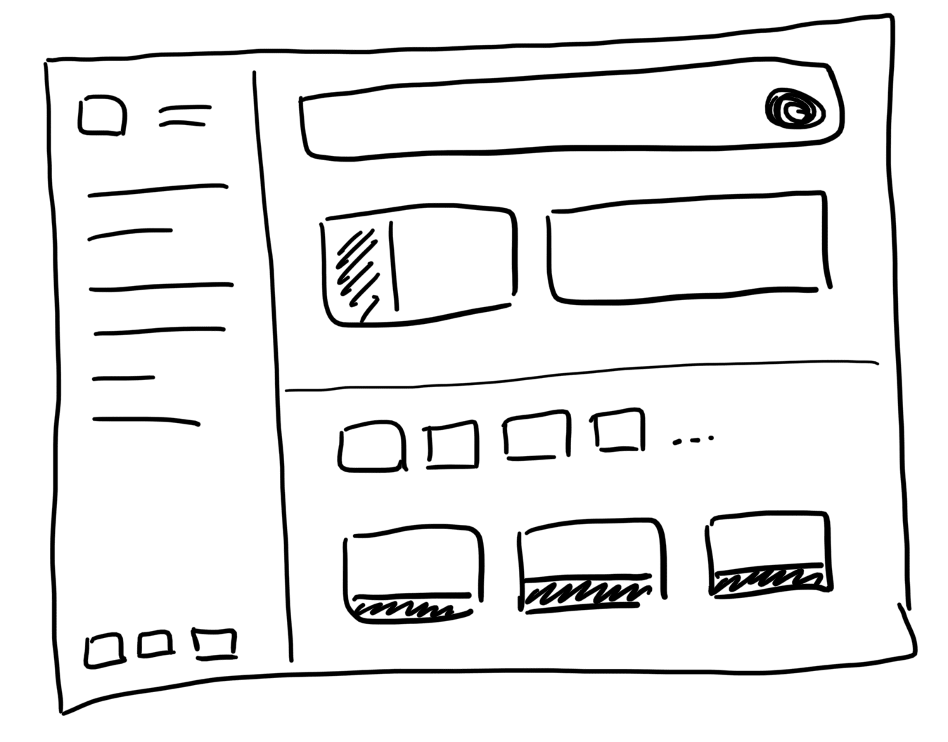
Before implementing a layout, I usually start with drawing a wireframe: a collection of lines and boxes on a piece of paper with labels of what each box should be. The following image shows the wireframe for the website we are building in this tutorial.

When my wireframe is ready, I need to think about how to translate it into HTML and CSS…
The max-width property
One main difference between the wireframe and the current state of the homepage that can be seen is the width of the content section. At the moment, each block element (headlines, paragraphs,…) takes up the full width of the browser window, but such long lines of texts are hard to read, so we want to limit the content width.

Now we’re finally back to coding! 👩💻 Open the code of the webpage in a text editor and go to the CSS file. We are going to add the following CSS rule:
.content-container {
  max-width: 640px;
}
The CSS rule alone doesn’t do anything, of course. We need to update the HTML code as well. In all my HTML files, I am going to wrap a div element with the class content-container around the text content. For the index.html page, this looks as follows (the ellipses … are placeholder for the text content to save some space):
<header>
  <div class="content-container">
    <h1>…</h1>
    <p>…</p>
  </div>
</header>
<main>
  <section>
    <div class="content-container">
      <h2>…</h2>
      <p>…</p>
    </div>
  </section>
  <!-- and so on… -->
</main>
Please note that I also introduced section elements on the index page to group the content of the main element. We didn’t do this when building the first version of the homepage but added sections only to the about and contact pages.
The same <div class="content-container"> should be added to the other HTML pages as well: the starting div right after the opening header or section tags and the closing div right before the closing header or section tags.

You might wonder why I didn’t just wrap the whole content of the page’s body but repeat the content-container several times. This is because I plan to add some background-color to the sections later that should span the full page width. You’ll see when we get there…
Auto margins to center content
After this small adjustment, the texts on our web pages are much better readable because of the reduced content width. The only thing that doesn’t quite match the wireframe is the position: the content should be centered on the page. There’s a nice way how to accomplish this. Enhance the content-container rule as follows:
.content-container {
  max-width: 640px;
  margin-inline-start: auto;
  margin-inline-end: auto;
  /*
  margin-left: auto;
  margin-right: auto;
  */
}
When you set margin to auto, it means: “take all the space that’s left”. And when you do this for the left and the right margin (or better: the inline-start and the inline-end margin), the available space is equally distributed on both sides of the element, which makes the content perfectly centered. 🎉
Collapsing margins
One thing you might have noticed when playing around with the box model properties in the browser’s dev tools is the behavior of margins of adjacent elements in block direction (from top to bottom). They do one special thing: they collapse.
This means that when a headline with a margin-bottom (or margin-block-end) is followed by a paragraph with a margin-top (or margin-block-start) the margins’ heights don’t add up, but the resulting space between those elements is equal to the larger of the two values.
There’s a wonderful article with super nice animations about the rules of margin collapse by Josh Comeau in case you are interested in all the details.
Creating a layout: adding space
One thing I still do not like about the current version of our tiny website’s layout is that all the content sections and texts and menu items stick together too much. I would like to give them more space to breathe to make the layout look less cluttered. I am going to work from top to bottom now, starting with the navigation, updating the section styles, and finally the footer.
CSS structure: type selectors vs. class selectors
Before we start, there’s one more thing I’d like to tell you about how I usually structure my CSS code. Can you remember the different types of CSS selectors? If not, go back to the last tutorial and refresh your memory.
We started our CSS file using type selectors for all the elements. We added styles for the nav, the footer, and others. Once our website grows, it could be that we are going to reuse these elements for other parts of the page and we always want to style navigation, or footer, or any other elements differently based on their usage. Instead of using type selectors for all elements, I am going to update some of them with class selectors.
The navigation
The markup for the main navigation elements will be enhanced with classes:
<nav class="main-nav">
  <a href="index.html" class="main-nav-link">Home</a>
  <a href="about.html" class="main-nav-link">About me </a>
  <a href="contact.html" class="main-nav-link">Contact</a>
</nav>
I want the navigation items to have more space between each other as well as above and below. Additionally, I’m going to add a subtle divider between the navigation and the header. This is how the CSS code should be updated:
/* change the selector "nav" to ".main-nav" */
.main-nav {
  /* existing styles */
  padding-block-start: 16px;
  padding-block-end: 16px;
  border-bottom: 1px solid lightgray;
}

.main-nav-link {
  margin-inline-end: 16px;
}
The header and sections
The header and content sections should be separated and need a little bit more breathing room, so I am going to add background colors, top and bottom padding. First, we need to update the HTML code. Find all header and section elements and add the following classes: <header class="page-header"> and <section class="content-section">.
Here is my additional CSS code:
.page-header {
  padding-block-start: 32px;
  padding-block-end: 32px;
}

.content-section {
  padding-block-start: 32px;
  padding-block-end: 32px;
}

.content-section:nth-child(odd) {
  background-color: #f0f0f0;
}
Here are three questions I guess you might have right now and my answers to them:
- Where to put new CSS code within the existing file? 📃
I start my CSS files with all the base styles for which I use type selectors. These are: the main font family, the websites text color, general link colors,… After that, I add rules using class selectors and sort them by appearance on the page. My rule of thumb here is: the order of the rules depend on the CSS selectors’ specificity. Less specific selectors on top, more specific selectors further down below. This way you can prevent that a very specific rule on top of your CSS file overrides another one that comes later which might lead to visual bugs. I try to work with the algorithm how styles are applied and not against it: what comes later in the code overrides what was written before. - When to choose margin and when padding when more space between elements is required? 🤷♀️
When working with borders around elements or background colors, it should be obvious what the difference of padding and margin is in this context. When I have a background-color or a border around an element and want the background and border to grow, I update the padding of the element. When I only care about the distance of my element to others, the margin is the property that should be updated. - What the heck is
:nth-child(odd)? 🤔
For setting a background-color for content sections we use a useful pseudo selector::nth-child..content-section:nth-child(odd)selects all odd content sections within the content of their surrounding element, which means in our case: the first, third, fifth, and so on content section within themainelement. You can find a detailed description about the power of this selector in the MDN documentation.
The footer
I want the same padding values I used for header and sections for my footer as well, so here are the code updates:
<footer class="page-footer">
  <!-- the content -->
</footer>
.page-footer {
  background-color: #3C2A4A;
  color: #ffffff;
  padding-block-start: 32px;
  padding-block-end: 32px;
}
Make sure to replace all occurrences of footer selectors in your CSS file with .page-footer.
The full code of this article can be found on GitHub. Go to repository.
Box sizing
Great, we made good progress in this part of the tutorial and learned a lot of things on the way! 💪 But before I’m going to summarize everything, there’s one more CSS property related to the CSS box model I want to show you: box-sizing.
Remember, every element on our webpage is a box with four parts: content, padding, border, and margin. We used the max-width property for our content sections above. The question is: what is the width value when referring to the size of our box?
Let’s go to the browser, navigate to the about page and select the content container in the header using the developer tools.
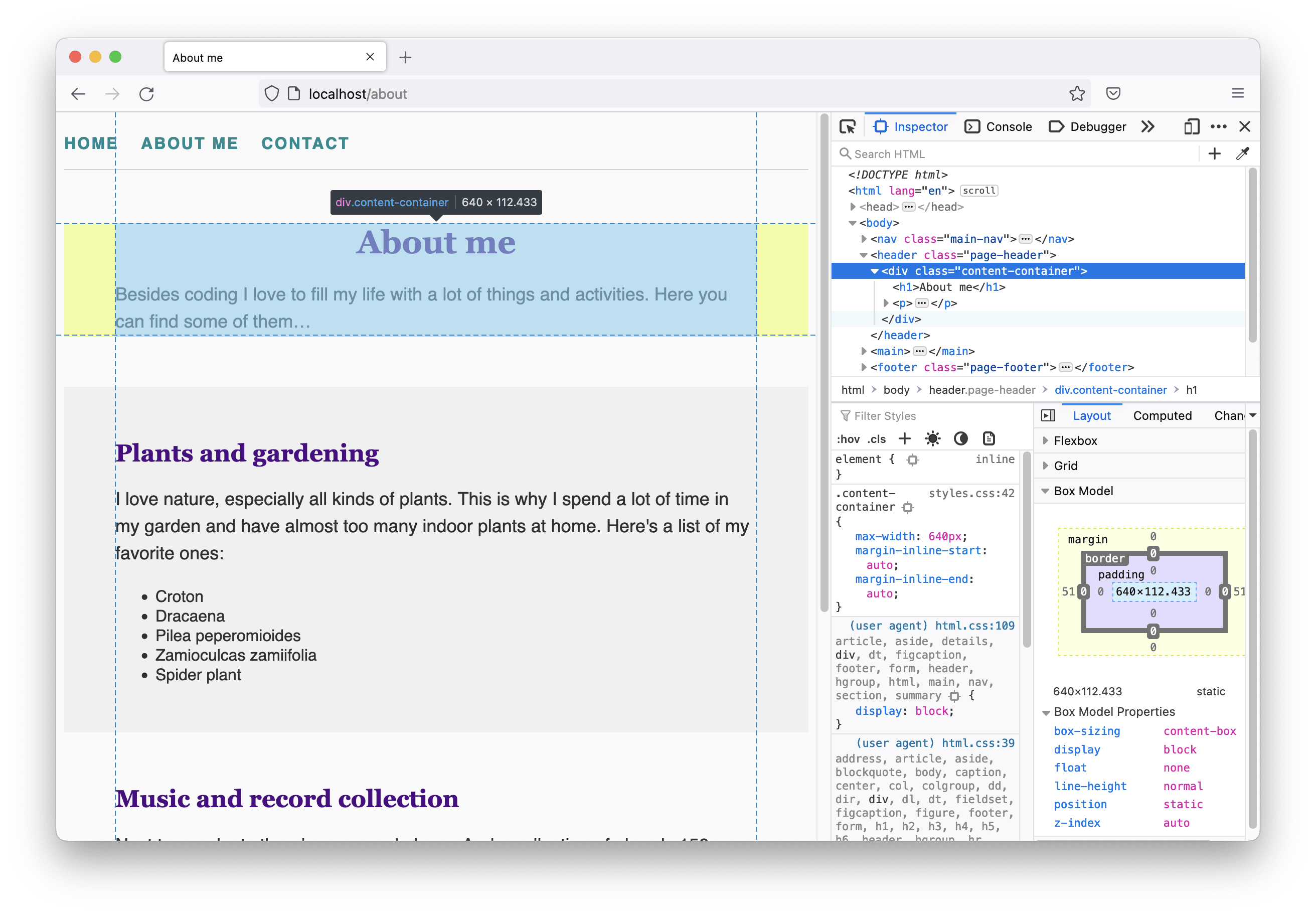
You can see that the current width of the element is 640px as defined. For demonstration purposes, I’m going to add a border of 1px width and a 20px padding on each side to the element.
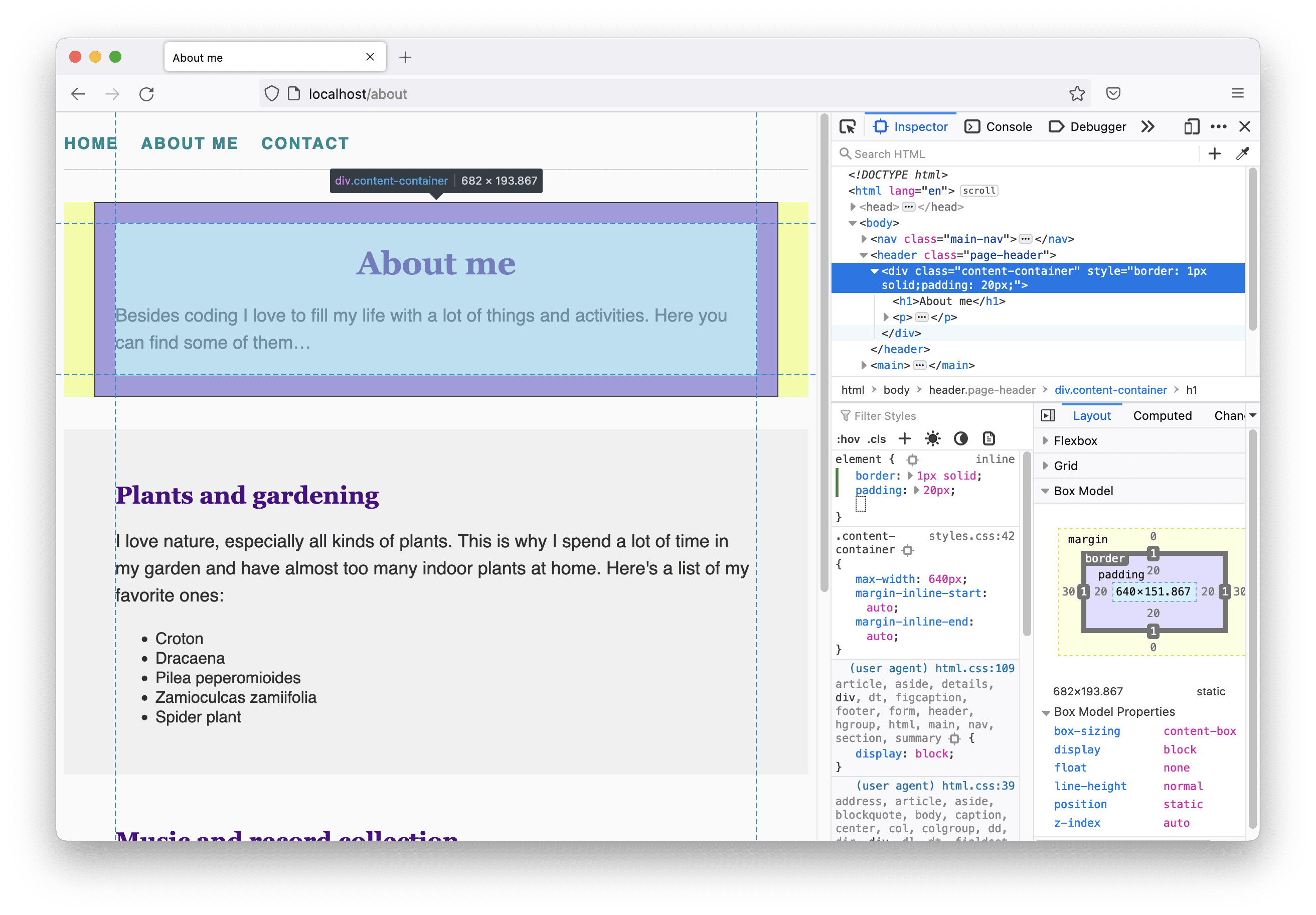
When I highlight the element again, I can now see that the width of the element is 682px, which is 42px more than before… 😱 The reason for that is that the initial value for the box-sizing property is set to content-box which means that every time a width is specified this value controls the width of the content. Padding and border-width values are added on top, which in our case means: 640px content width + 20px left margin + 20px right margin + 2px border-width (1px on each side) = 682px in total.
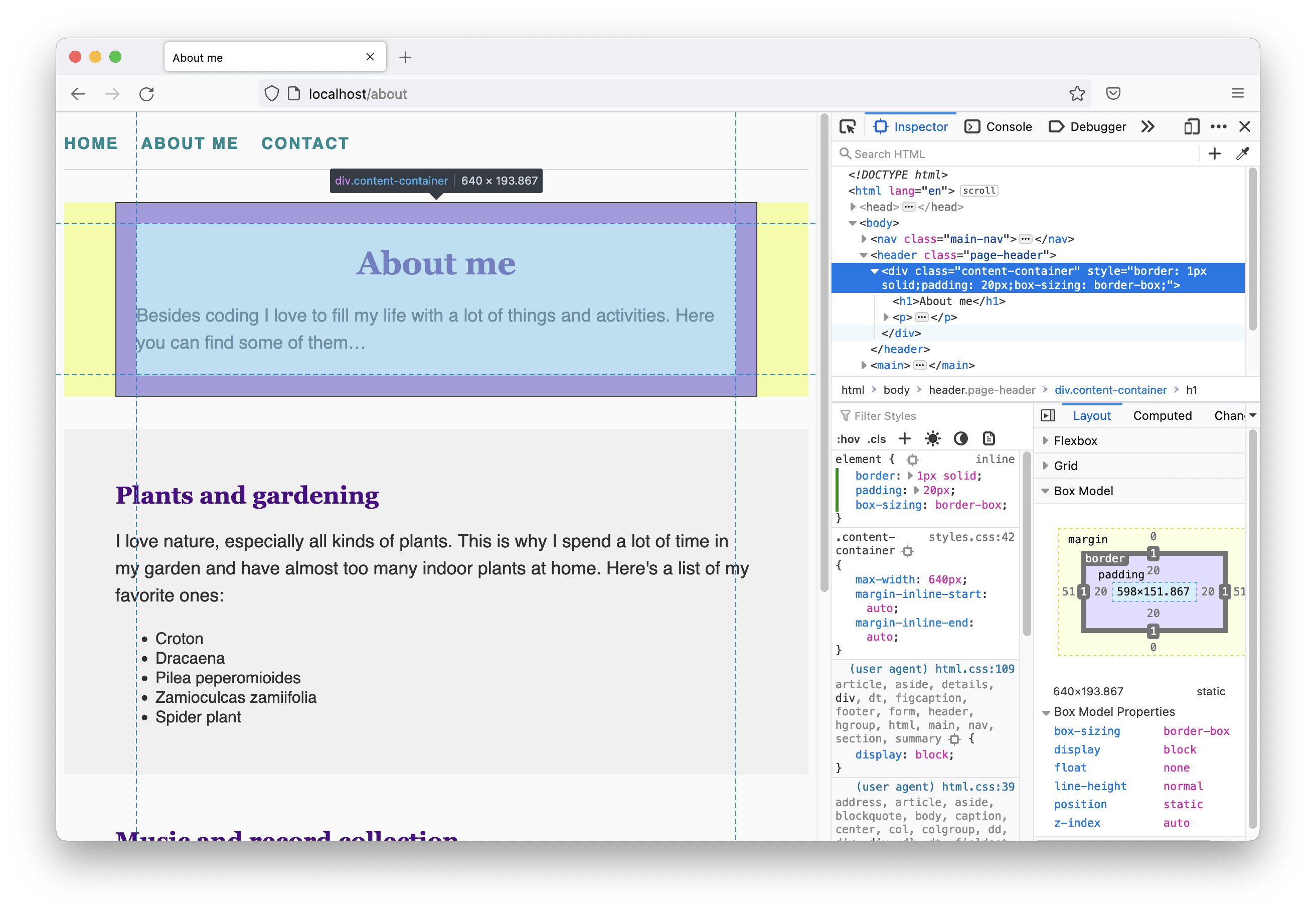
Very often when setting an element’s width, it is useful that this value refers to the box including the padding and the border. This can be achieved by overriding the default value content-box with border-box. The box including the border is now 640px wide and the content area is this value subtracted by the padding and border-width, i.e. 598px.
I like this behavior much more than the default (and other developers as well, thus this fact made it on an incomplete list of mistakes in the design of CSS 😉), so I usually start my CSS files with the following rule:
* {
  box-sizing: border-box;
}
The * is called the universal selector and matches elements of any type. By the way, this selector has no specificity.
CSS shorthand properties
One last CSS-related fact before we’re done for today… You can see in the screenshots above that I’ve added padding: 20px to the content section. This means that 20px should be added on each side of the box. This is called a shorthand property. In our code examples above, we set values explicitly for padding-block-start and padding-block-end. We could also write this as padding: 32px 0, which means: add 32px to the top and bottom and no padding to the right and left.
Another shorthand is border. We can either write
.my-element {
  border-width: 1px;
  border-style: solid;
  border-color: lightgray;
}
or shorten the code like this:
.my-element {
  border: 1px solid lightgray;
}
It depends on what you want to achieve whether it’s better to use the one over the other. You will gather your own experiences along the way and make decisions based on them.
Key takeaways
Today was all about the CSS box model and layout basics. This is what you should remember and keep in mind for the next tutorial parts:
- Every element on a webpage is a box.
- A box has content, padding, border, and margin.
- There are “block-boxes” and “inline-boxes” which have different characteristics and behave differently.
- The default layout mode in CSS is “flow layout”.
- To implement a given layout we need to update our HTML code structure as well as the CSS code.
- We can adjust paddings and/or margins of elements to give them more space.
- Margins can collapse in certain circumstances.
- Box-sizing refers to the effect of setting the width of an element and can be changed from the default
border-boxtocontent-boxwhich is more intuitive. - There are shorthand properties in CSS.
If you have some more minutes to spend on this part of the tutorial, go back to the browser and your code and play around with the properties we learned today: update margin and padding values and add borders to elements. Use the browser’s developer tools to investigate what happens when you change these values.
Next time we’re continuing our web development journey and talk about responsive web design basics. 🤩 This will be the groundwork for the upcoming tutorials about advanced layout modes like “CSS Flexbox” and “CSS Grid” – stay tuned!