It’s been a while since my last post… This article is a part of my web development basics tutorial series that started off with an article about HTML basics and was followed by the first steps for building a small website. Make sure to have the code from the last parts ready as we will use it as a starting point for today's tutorial.
In case you want to skip the previous parts, you can head over to GitHub and check out the repository where I add the example code of each step of this tutorial.
Found it? Then let’s get started!
Why and where to use forms
It’s quite likely you’ve used a form on the web today already, for example a login form, a search form, a registration form, a checkout form,… there are loads of them. Everywhere.
Forms on the web are needed for interaction between the user and the website or application. It’s always about sending or retrieving data to or from a server/database a.k.a. “the backend”. In today’s post we will focus on the frontend part only. We’ll use HTML tags to build a contact form and integrate it on our small website. We won’t send or process any data, this will be something for a future article.
On our website’s contact page we want the user to fill out a form providing the following data:
- name
- age
- contact reason
- newsletter subscription
- message
The form tag
Every form starts with a <form> tag. Easy to remember and as simple as shown in the following code snippet:
<form action="..." method="POST">
  <!-- form elements -->
</form>
A form tag can have multiple attributes. The most important ones are action and method, which are required if you want to actually send the data. As mentioned above, we’re focusing on the frontend part of the form today, therefore I won’t explain these two attributes in detail. Here are just the basics:
- The
actionvalue is the URL (defined by the server) the form data is sent to on form submit. It’s about where to send the data. When not adding the action attribute, the data is sent to the current page the form is on (which is fine for now). - The
methodvalue can be eitherGETorPOST. GET is used when you want to get data from a server, e.g. when submitting a search parameter or filter values in a web shop. POST is used when sending data to a server that is processed and stored there, e.g. when submitting a login form, a user registration form, or a checkout form in a web shop. This attribute is about how to send the data.
Inputs and labels
There are a lot of different input field types available. Let’s start with the most basic one: the text input field.
<input type="text" />
Note: The input tag is self-closing.
To tell the user what to enter in the text input field, we will add a meaningful label and connect it with the input field like this:
<label for="name-input">Name</label>
<input id="name-input" type="text" name="name" />
The id attribute of the input and the for attribute of the label share the same value. This way the label is semantically connected to the input field and a screen reader will know that these two tags belong together. If input and label are connected this way, clicking on the label focuses the field, i.e. the cursor shows up in the text input and you can start typing.
The name attribute (coincidentally, in this case the key and the value of the attribute are equal 🤯) is needed later on when the data sent by the form is processed. It identifies the data entered by the user when sending it to the server.

Input types
As you might have guessed, there are more input types available than just text. For our contact form we want the user to enter their email address and their age. For this, we can use the email and number input types, respectively.
<label for="email-input">Email address</label>
<input id="email-input" type="email" name="email" />

<label for="age-input">Age</label>
<input id="age-input" type="number" name="age" />
All three input types—text, email, and number—look the same for the user, but the available features are different.

Note: Input fields don’t appear in the middle of the screen by default. I cheated a bit and used some CSS for the screenshots. 😉
The email input type triggers a different keyboard layout on mobile—the one with the @ character visible right away. Recently used email addresses can be selected to avoid additional typing time.

In the number input field only numbers are valid characters to enter and there’s a control visible to increase or decrease the number. On mobile devices the keyboard containing all the numbers is shown by default when focusing the input field.

There are many more input types available, like password, color, search, file,… Later, we’ll have a look at two more which are used in forms very often. For now, let’s add what we’ve already learned to our website.
Adding a contact form to an existing HTML file
Navigate to your website we built together in the last tutorial article and open the contact.html page in a text editor to edit the code and a browser to have a look at the result.
There’s already a section on the page containing all relevant contact information. Let’s add another section for the contact form above and put all the pieces together. Now the HTML file should look like this:
<!-- document head and header -->
<section>
  <h2>Contact form</h2>
  <form action="" method="POST">
    <div>
      <label for="name-input">Name</label>
      <input id="name-input" type="text" name="name" />
    </div>
    <div>
      <label for="email-input">Email address</label>
      <input id="email-input" type="email" name="email" />
    </div>
    <div>
      <label for="age-input">Age</label>
      <input id="age-input" type="number" name="age" />
    </div>
  </form>
</section>
<!-- contact data section and footer -->
Note: I added div tags to group label and input to make them appear below each other instead of next to each other. (You can try what happens if you remove the div tags!) We’ll have a closer look at the page’s layout as soon as we add styles with CSS.
I also added h2 headlines to both sections. The first one is called “Contact form”, the second one below “Contact data” to provide a better structure, now we’re adding more content.
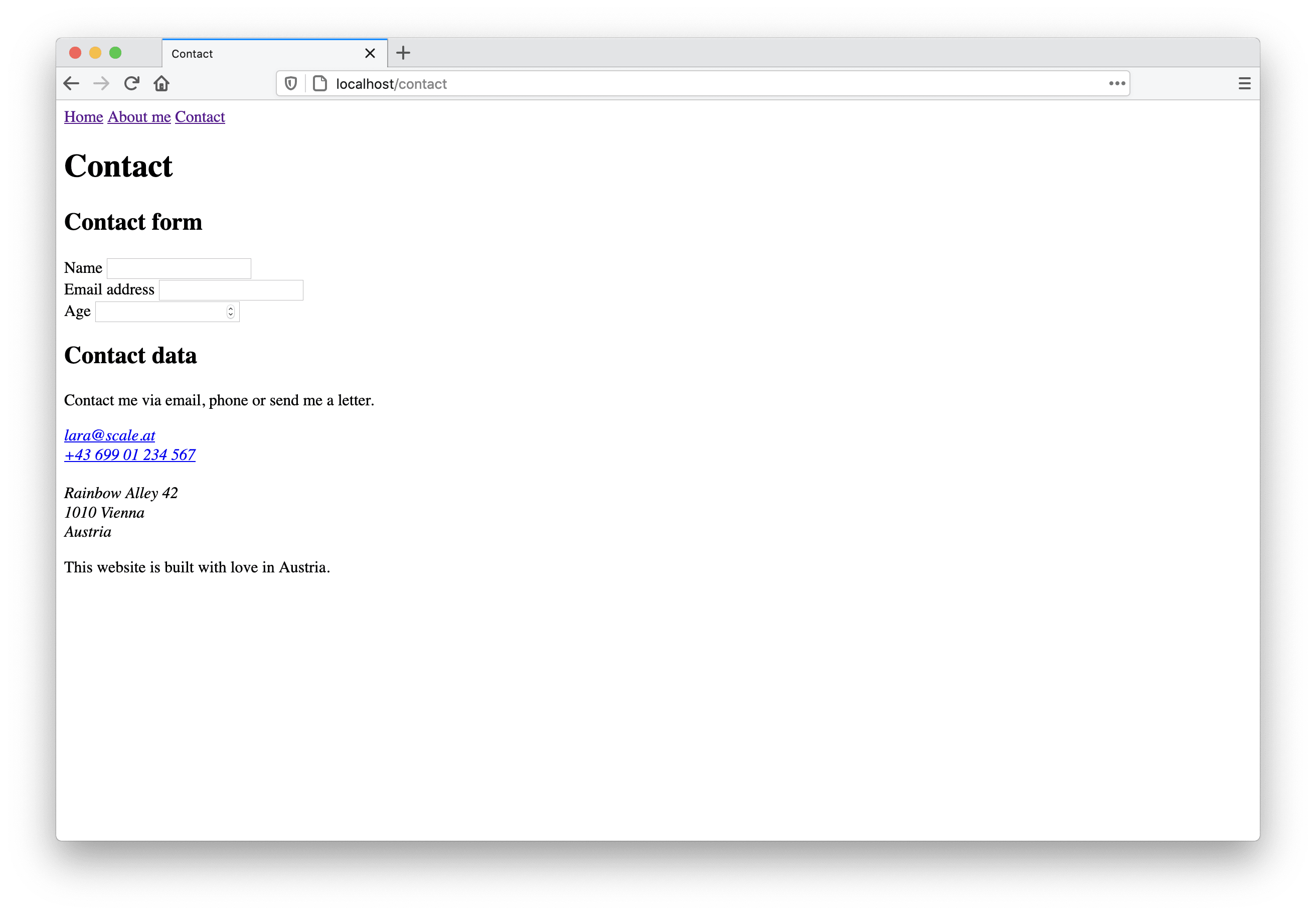
In the screenshot above you can see how our contact page and the form looks like without any styling, just plain HTML.
The full code of this article can be found on GitHub. Go to repository.
Turn options on and off
In our contact form we want to give the user the option to subscribe to our newsletter. The HTML element to use for this is an input field with the type checkbox. A checkbox is used when the user should be able to turn options on and off or when they should select one or more options from a group of available values. To create our newsletter checkbox we have to add the following few code lines to our form:
<form action="" method="POST">
  <!-- name, email, age inputs -->
  <div>
    <input type="checkbox" id="newsletter-checkbox" name="newsletter" value="newsletter-subscription" />
    <label for="newsletter-checkbox">Yes, I want to receive yor monthly newsletter!</label>
  </div>
</form>
We already know that the id attribute is used to associate the label with the input. This time I put the input before the label in the HTML code, because I want the checkbox to be on the left side of the label text. As before, I use a div around the input and label to put them in their own line (more about that in our first CSS tutorial, I promise!).
The name and the value attribute are never seen by the user—they come into play when sending the data to the server. We’ll have a closer look at that in a few minutes.
Choosing from a list of values
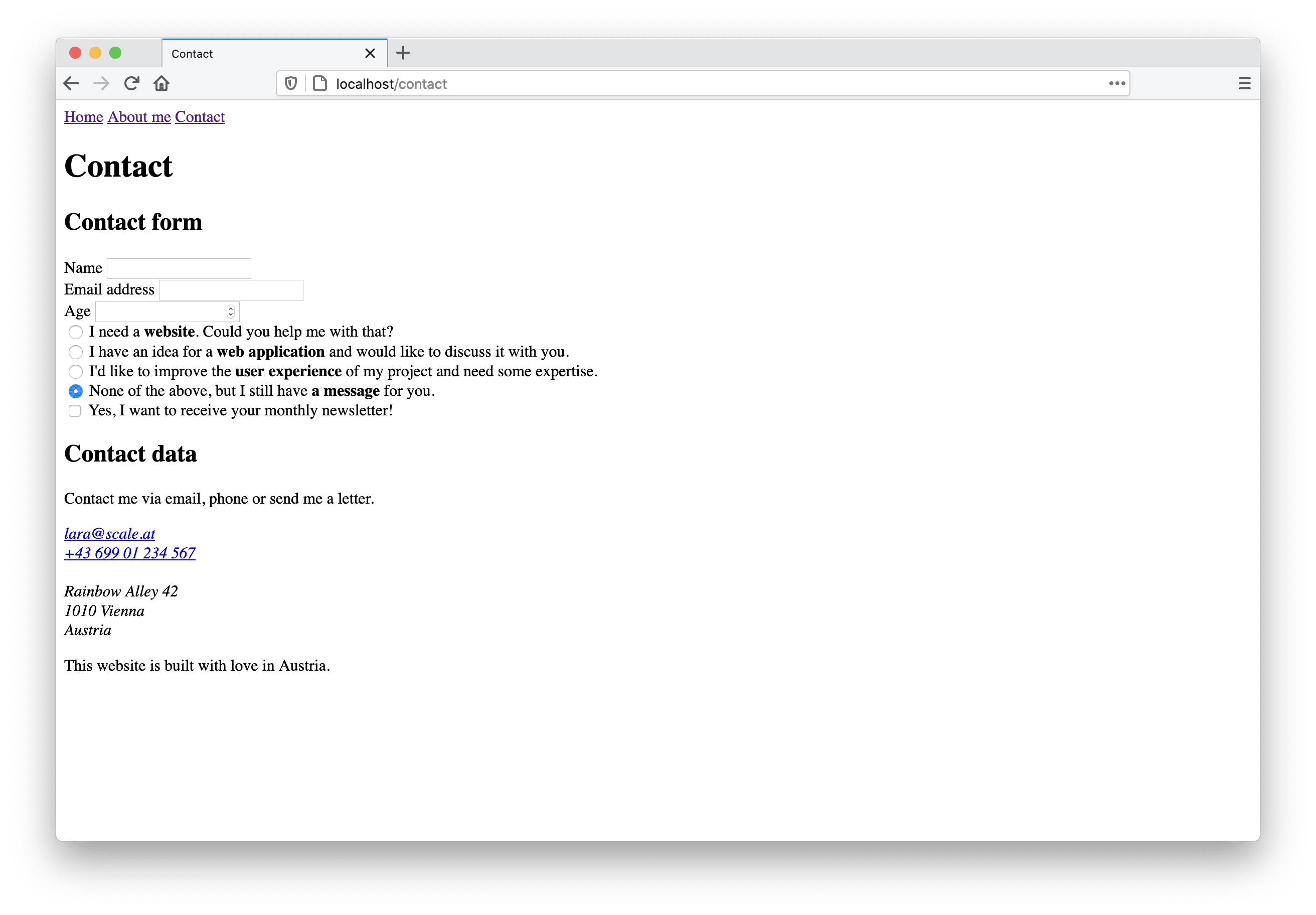
If only one option from a set of related options should be selected, using radio buttons is the way to go. In our form, we want to ask the user why they contacted us. Add the following lines to the form between the age input and the newsletter checkbox:
<form action="" method="POST">
<!-- name, email, age inputs -->
  <div>
    <input type="radio" name="contact-reason" id="website-request-input" value="website-request" />
    <label for="website-request-input">I need a <strong>website</strong>. Could you help me with that?</label>
  </div>
  <div>
    <input type="radio" name="contact-reason" id="app-request-input" value="app-request" />
    <label for="app-request-input">I have an idea for a <strong>web application</strong> and would like to discuss
      it with you.</label>
  </div>
  <div>
    <input type="radio" name="contact-reason" id="ux-request-input" value="ux-request" />
    <label for="ux-request-input">I'd like to improve the <strong>user experience</strong> of my project and need
      some expertise.</label>
  </div>
  <div>
    <input type="radio" name="contact-reason" id="random-request-input" value="random-request" checked />
    <label for="random-request-input">None of the above, but I still have <strong>a message</strong> for you.</label>
  </div>
<!-- newsletter checkbox -->
</form>
Yep, that’s a lot of code, let’s take some time and have a closer look at the individual lines. The input type we use here is radio. To make sure that all four radio buttons are part of the same radio group, they must have the same name attribute value—contact-reason in our case. The id is needed to associate the label with the input; this is nothing new, we know that already from other input types. As you’ve previously learnt, the value of the selected option is sent on form submit.
The last radio option in our contact form should be selected by default. Therefor we add the checked attribute. The available values for this attribute are either true or false, which is called a Boolean value. In this case you don’t have to explicitly add a value; the attribute name alone is enough to tell the browser that the option should be checked.
When the user selects another option in a radio button group, the currently checked option gets unchecked. Only one option can be selected (checked) at a time within a radio group.
This is what our contact page now looks like when we open the contact.html file in a browser:
Select as radio button alternative
If the list of available options gets longer, it’s probably better to show a dropdown instead of many radio buttons, as not to overwhelm the user with a lot of information at once. The HTML elements we need in this case are <select> and <option>. We won’t add this to our form, but I’ll quickly show you how our radio button group would look if we use a select element instead.
<label for="contact">Select the reason why you contact me</label>
<select id="contact" name="contact">
  <option value="website-request">I need a website. Could you help me with that?</option>
  <option value="app-request">I have an idea for a web application and would like to discuss it with you.</option>
  <option value="ux-request">I'd like to improve the user experience of my project and need some expertise.</option>
  <option value="random-request" selected>None of the above, but I still have a message for you.</option>
</select>
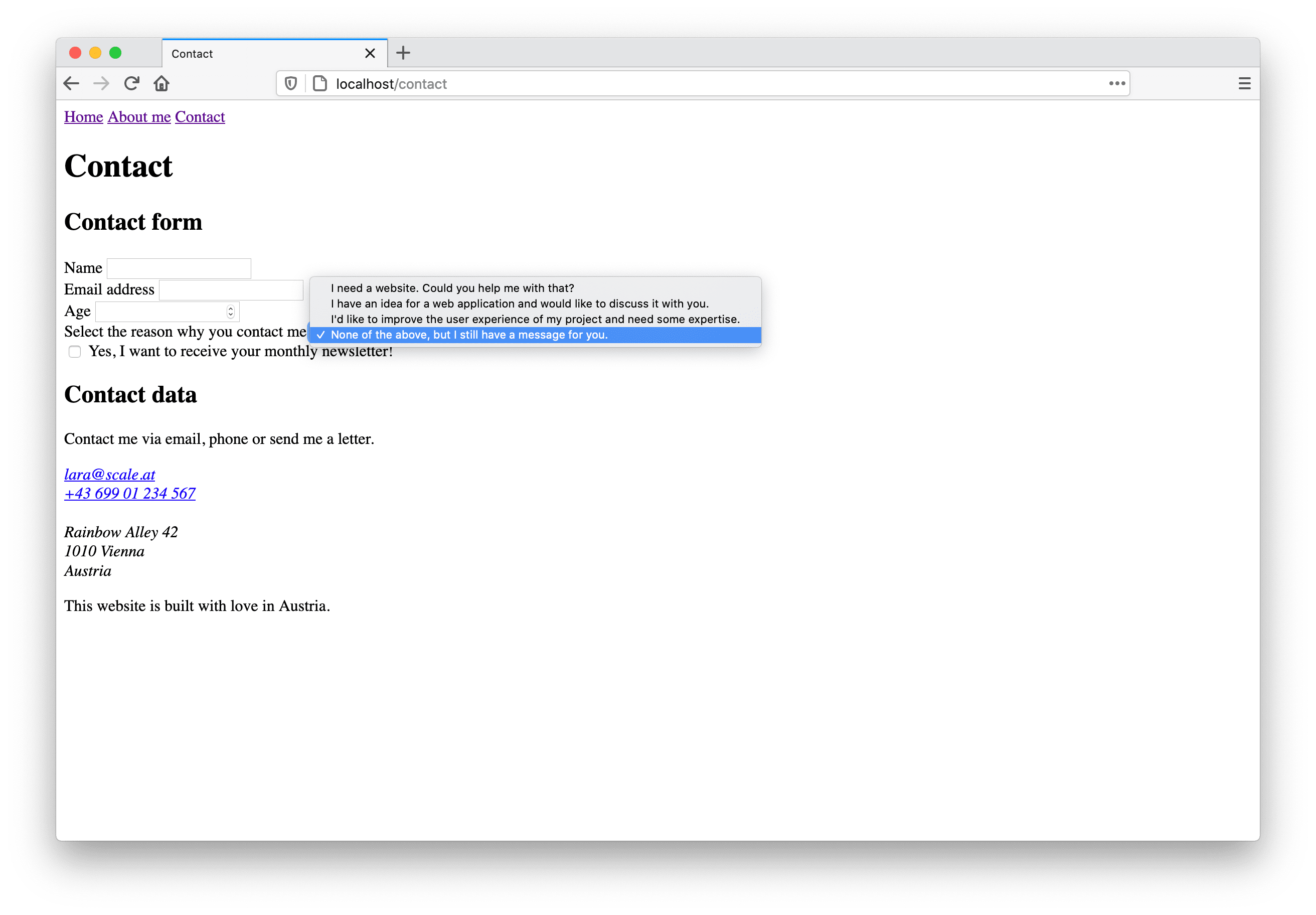
What has to be considered here is that on mobile devices, native dropdown components don’t provide enough space for long option texts. In this case, the website user can’t view all the relevant information, which is bad.

In our example we could reduce the amount of text when using a select element instead of radio buttons to fix this problem:
<label for="contact">Select the reason why you contact me</label>
<select id="contact" name="contact">
  <option value="website-request">Website request</option>
  <option value="app-request">Web application request</option>
  <option value="ux-request">User experience request</option>
  <option value="random-request" selected>Custom message</option>
</select>
As you can see, in web development you often have more than one option to implement certain features. To make the right decision, think about your users and what would lead to the best experience for them when using your website or application.
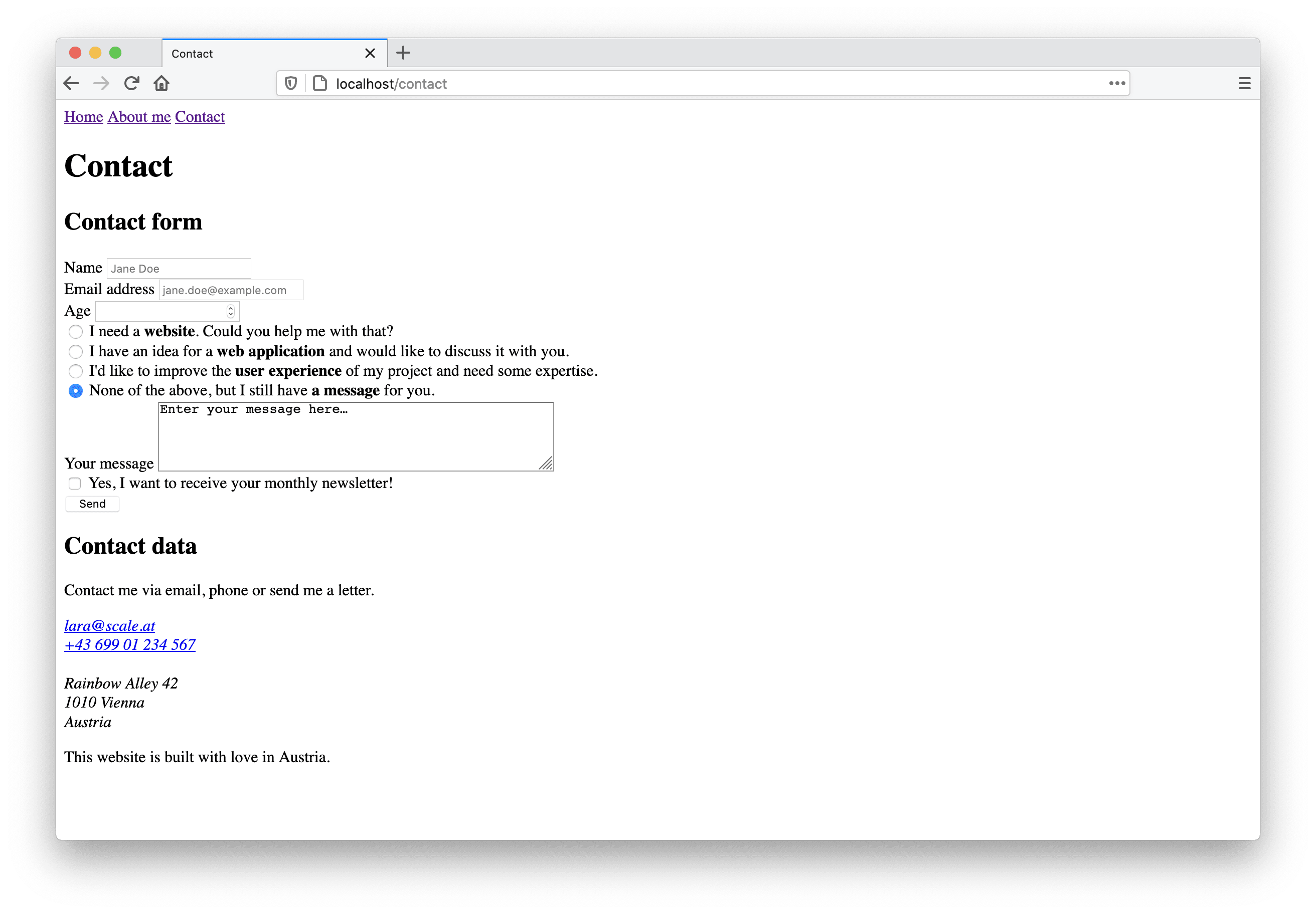
Text area for long messages
Let’s get back to our contact form. There’s one input field left we need to add: a place where the user can enter a custom message. We could use the text input field again, but there’s another input element that better fits our needs: the textarea. It’s not an input tag with a dedicated type attribute but a separate tag altogether. Let me show you:
<label for="message-input">Your message</label>
<textarea id="message-input" name="message"></textarea>
Using the rows and cols attributes you can specify how big the text-area should be.
<label for="message-input">Your message</label>
<textarea id="message-input" name="message" rows="4" cols="50"></textarea>
The textarea tag is not self-closing. You can enter text between the opening and the closing tags. This is the default text displayed to the user.
<label for="message-input">Your message</label>
<textarea id="message-input" name="message" rows="4" cols="50">Enter your message here…</textarea>
Input attribute values
There are many ways to configure form fields in HTML. Depending on the input type there are additional attributes available to help the user filling out the form correctly.
Required fields
We can inform the user of required fields by adding the required attribute to the input. Remember the Boolean checked attribute? It’s the same for required—there’s no value needed.
<input id="name-input" type="text" name="name" required />
In our contact form we want the user to at least enter a name, an email address and a message, so we add the required attribute to those three inputs, like this:
<input id="name-input" type="text" name="name" required />
<input id="email-input" type="email" name="email" required />
<textarea id="message-input" name="message" rows="5" cols="50" required>Enter your message here…</textarea>
Placeholder text
Placeholder text can be added additionally to tell the user what input you expect by means of the placeholder attribute. Have a look at the following code example and screenshot:
<input id="name-input" type="text" name="name" placeholder="Jane Doe" required />

<input id="email-input" type="email" name="email" placeholder="jane.doe@example.com" required />

Don’t use placeholders instead of labels, especially not in longer forms. A soon as the user starts typing in an input field, the placeholder is not visible anymore and we don’t want our users to have to remember what the field is about.
Minimum and maximum values
For the number input type you can specify a minimum and/or maximum value using the attributes min and max. It makes no sense to enter a negative value for age. And we don’t expect children to contact us, so let’s set the minimum valid age to 14 like this:
<input id="age-input" type="number" name="age" min="14" />
Visually nothing changes, but as soon as the user enters a value, everything below 14 is marked as invalid by the browser.
Submitting the form
In this part of the web development basics tutorial series we focused on building a contact form using new HTML tags we learned today. Your form should now consist of the following input elements:
- text input (name)
- email input (email)
- number input (age)
- radio buttons (contact reason)
- textarea (message)
- checkbox (newsletter subscription) – let’s move this one below the text area
A form that doesn’t send data anywhere doesn’t really make sense, but this will be part of another blog post. Luckily, using the browser’s developer tools, we can have a look at what happens when we click the form’s submit button. Wait… where is our submit button? Let’s add this final input to the end of the contact form:
<input type="submit" value="Send" />
Congrats! You just built your very first HTML form! 🎉 This is how the contact page should look in the browser right now:
This is the form's final HTML code:
<form action="" method="POST">
  <div>
    <label for="name-input">Name</label>
    <input id="name-input" type="text" name="name" placeholder="Jane Doe" required />
  </div>
  <div>
    <label for="email-input">Email address</label>
    <input id="email-input" type="email" name="email" placeholder="jane.doe@example.com" required />
  </div>
  <div>
    <label for="age-input">Age</label>
    <input id="age-input" type="number" name="age" min="14" />
  </div>
  <div>
    <input type="radio" name="contact-reason" id="website-request-input" value="website-request" />
    <label for="website-request-input">I need a <strong>website</strong>. Could you help me with that?</label>
  </div>
  <div>
    <input type="radio" name="contact-reason" id="app-request-input" value="app-request" />
    <label for="app-request-input">I have an idea for a <strong>web application</strong> and would like to discuss
    it with you.</label>
  </div>
  <div>
    <input type="radio" name="contact-reason" id="ux-request-input" value="ux-request" />
    <label for="ux-request-input">I'd like to improve the <strong>user experience</strong> of my project and need
    some expertise.</label>
  </div>
  <div>
    <input type="radio" name="contact-reason" id="random-request-input" value="random-request" checked />
    <label for="random-request-input">None of the above, but I still have <strong>a message</strong> for
    you.</label>
  </div>
  <div>
    <label for="message-input">Your message</label>
    <textarea id="message-input" name="message" rows="5" cols="50" required>Enter your message here…</textarea>
  </div>
  <div>
    <input type="checkbox" id="newsletter-checkbox" name="newsletter" value="newsletter-subscription" />
    <label for="newsletter-checkbox">Yes, I want to receive your monthly newsletter!</label>
  </div>
  <input type="submit" value="Send" />
</form>
Form validation
When you click the submit button without filling out any of the input fields, you find out at first hand what form validation is. The browser informs you that you didn’t fill out the required name and email input fields, highlights the errors and prevents the form from being sent. Custom validations can later be added using JavaScript.
We as web developers should never trust user input. If you decide to send the form data to a server and put it into a database, it’s very important to also validate the data in an environment you control (i.e. the backend). The frontend/client side validation is helpful to guide the user in providing the expected data, the backend/server side validation is necessary for security reasons.
Form data on submit
If you’re interested in how the data looks like when sending the form, have a look at your contact page in your browser and open the developer tools. Once open, search for the “Network” tab and open it instead of the “Elements” (Chrome) or “Inspector” (Firefox) tab. Fill out the form with some test data and click the “Send” button.

In the network tab, a new request should show up. When you click it, more details will be revealed. We’re interested in the “Request”. We can see, that the method of the request was POST, this is what we defined as form method in the beginning. When looking at the request details we see exactly the input field names we defined (name, email, age, contact-reason, message, newsletter) and the values entered by the user. For the radio buttons and the checkbox the values defined by us are used. This is the form data a server would receive.
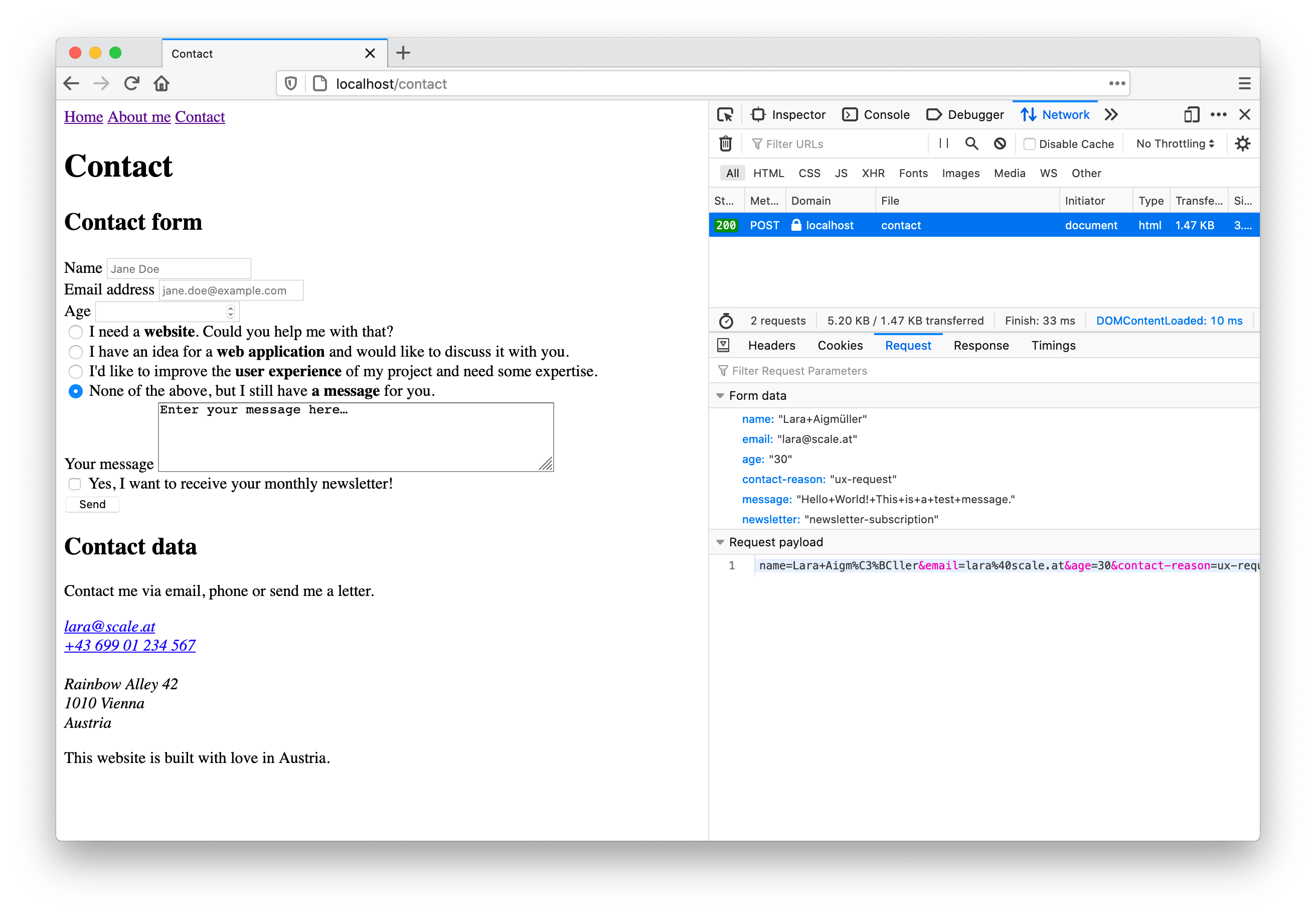
Try it again with other data and compare what changes in the request!
A word about accessibility and UX
When building things for the web with accessibility and good UX (user experience) in mind right from the beginning, everyone will benefit and users are more likely to return to your website or web app. Here are a few points worth considering when building forms:
- Don’t use placeholders instead of labels. It might be okay for small forms where the user has to enter e.g. an email address and a password. However, when forms get longer it’s helpful if the labels are still there after the user entered data.
- Forms should be accessible via keyboard. Users should be able to navigate from one input field to the next by pressing the
TABkey. As long as you use native HTML features (inputs, text areas, buttons,…) this is supported by every browser.
Prevent validation errors before they happen
It’s frustrating when you fill out a form and click the send button, only for a lot of errors to appear. Why does this happen anyway? Mostly, because it’s not clear what should be entered. Help the user to prevent validation errors in the first place—if they happen anyway, help the user fixing them. Here are a few final tips:
- Use descriptive labels for all your form fields.
- If you define min/max values for numbers or make fields required within code, also tell your user in text form.
- Make use of the input field’s
patternattribute if certain characters are not allowed in a text input. - Whether to use radio buttons or a select depends on the number of options and their text length.
- Provide meaningful error messages and tell the user how to fix the error.
Summing up
This is what we learned today:
- how to create and add a small contact form to a HTML page
- there are different input types available: text, email, number, checkbox, radio, and more…
- every input should have a meaningful label
- we can have a look at the submitted form data in the browser’s developer tools
- there were some tips about accessibility and UX as well
If you want to dig deeper into accessible form design, I recommend checking out Geri Reid’s best practice guidelines for form design, including a lot of links to other useful resources.
In the last three posts of this series about web development basics we learned many interesting facts about HTML, the heart of every website and web application. As already mentioned in the beginning, there’s of course more than that…
Next time we’ll start looking at the second of three languages you’ll need to know to build great things for the web: CSS (short for “Cascading Style Sheets”). Once you know the basics you can give your website a unique look and feel. 🎨 As soon as you’re more familiar with CSS you will be able to build great page layouts and make the form we built today look much(!) better. I’m already looking forward to it! Are you?