A page of our small example website we didn’t really take care of until now is the contact page. In part three of this tutorial series we’ve built a small accessible contact form with HTML. Today we are going to style and layout it with CSS. 🥳
As always, find the example code from the last part, and open the contact.html page in a text editor and a browser. If you can’t find your own work, you could also check out my version that is available on GitHub, where you can have a look at the code of each step of this web development basics tutorial series.
Recap: HTML form markup
Let’s have a quick look at the HTML code and get familiar again with all the form related tags. We’ve created a <form> and added a lot of different <input> elements with corresponding <label> elements wrapped by <div> containers.
Remember that each input element needs some sort of label and the best way for this is to use the <label> tag and “connect” the two using the id attribute on the input tag and the for attribute (having the exact same value) on the label tag.
This looks as follows for the name input field:
<div>
  <label for="name-input">Name</label>
  <input id="name-input" type="text" name="name" placeholder="Jane Doe" required />
</div>
After we’ve added some basic styles and layout during the last tutorials, this is what the contact page looks in the browser at the moment:
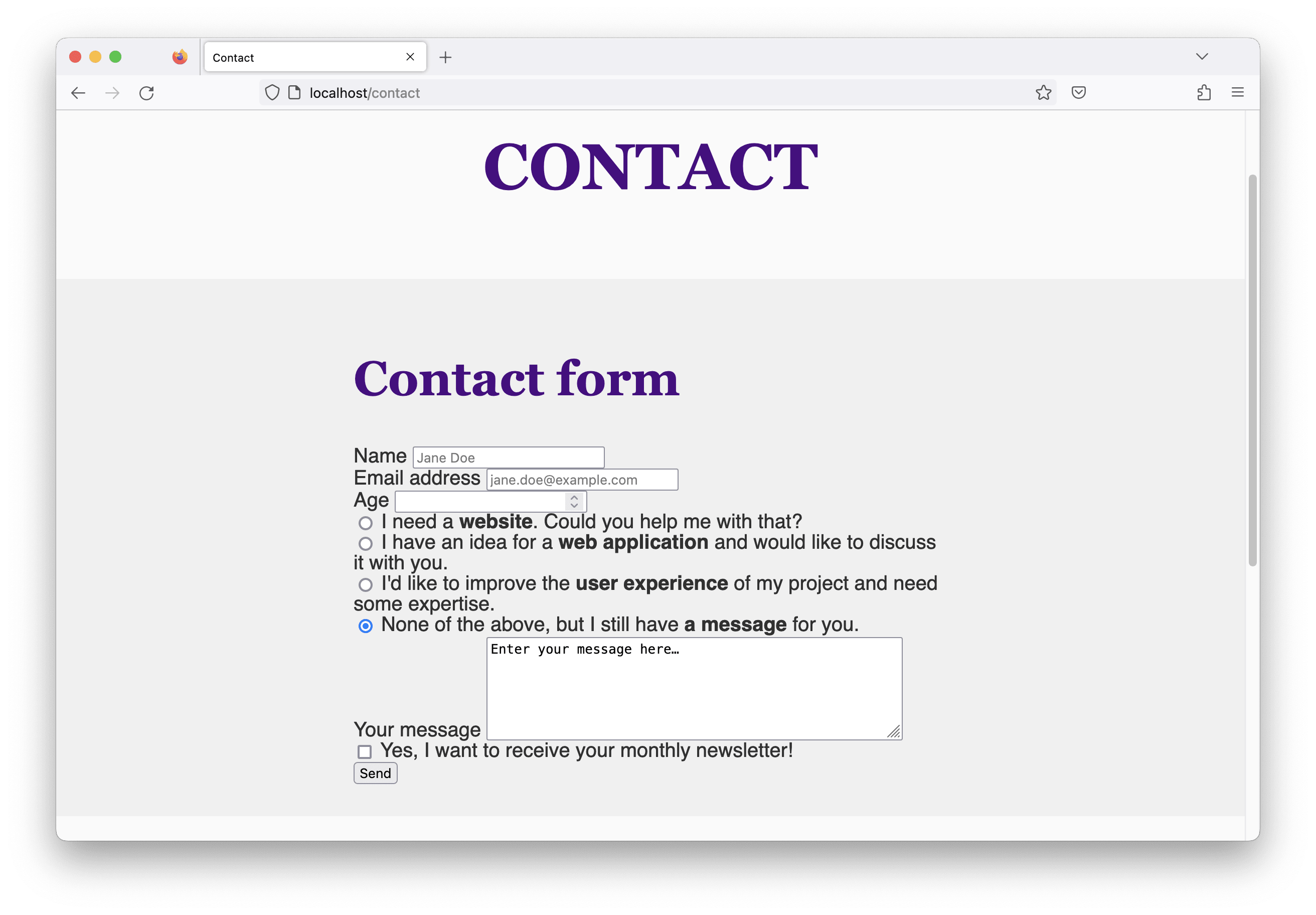
There’s definitely some room for improvement here… 😊
Translating wireframes into HTML
Again, we are first going to have a look at wireframes that describe the basic layout of the form visually for small and large screens.


The challenge now is to find markup that works with both versions and can be transformed with CSS from one into another with some of the features we’ve learned last time about responsive web design.
For this part of my website I’d like to use CSS grid layout, another powerful layout mode. In order to decide on the HTML structure, a little grid knowledge is required, so I’m going to share my approach with you now and describe each decision step by step.
A quick side note: At the end of last year I wrote an article for HTMHell about how I usually approach this wireframe-to-HTML transformation based on another example. Have a look if you are interested and would like to get more insights into my thought process! 💭
CSS grid layout: an introduction
The CSS grid layout mode is similar to the CSS flexible box layout in certain aspects, but instead of just one direction it defines two directions: rows and columns. (Remember, with flex layout we could choose between flex-direction: row and flex-direction: column.)
What they have in common is the fact that once I set display: grid to an element, this one becomes the grid container and the direct child elements become grid items and can be placed within the grid.
Changing the markup
Our current HTML markup is structured as follows:
<form>
  <div>
   <label>...</label>
   <input ... />
  </div>
  <div>
   <label>...</label>
   <input ... />
  </div>
</form>
I want the form to become the grid container, but then the div elements would become grid items. In the wireframe above, though, the labels and the inputs are placed in different columns, so I need these elements to become my grid items, which means they need to become the direct children of the form element. (Once CSS subgrid is supported in all major browsers, we can talk about this again and choose a different approach. By the time of writing this article it is only supported in Safari and Firefox.)
What we need to do now is to restructure our HTML code in a way that each item (or group of items) that is placed in another column of the two column layout is a direct child element of the <form> tag. Therefore, I remove the <div> wrapper elements from the name, email, age, and message fields.
The checkbox input and its label for the newsletter subscription keep the div wrapper, because I don’t want to tear the checkbox and its label apart.
An accessible radio group
Similar to the checkbox, I keep the radio inputs and their labels grouped as well, wrap them in an additional containing element, and add a label for the group.
<div id="contact-reason-label">What’s the reason of your contact request?</div>
<div role="radiogroup" aria-labelledby="contact-reason-label">
  <div>
    <input type="radio" id="website-request-input" ... />
    <label for="website-request-input">I need a <strong>website</strong>. Could you help me with that?</label>
  </div>
  <!-- more radio input elements -->
</div>
To describe the semantic meaning of the additional group label and where it belongs I added the ARIA role="radiogroup" attribute to the additional div container. The aria-labelledby attribute uses the value of the label’s id, similar to how we connect an input with its label with id and for.
Grouping radio buttons can (and should usually) be done using a <fieldset> with a <legend> and no need of additional ARIA attributes. This comes with drawbacks regarding our desired layout, so I chose the above solution instead.
Building the layout for small screens
As described in the last tutorial series part, I prefer implementing the one column layout first. In my browser, I open the developer tools, switch to the responsive design mode in Firefox, and set my viewport size to 380px.
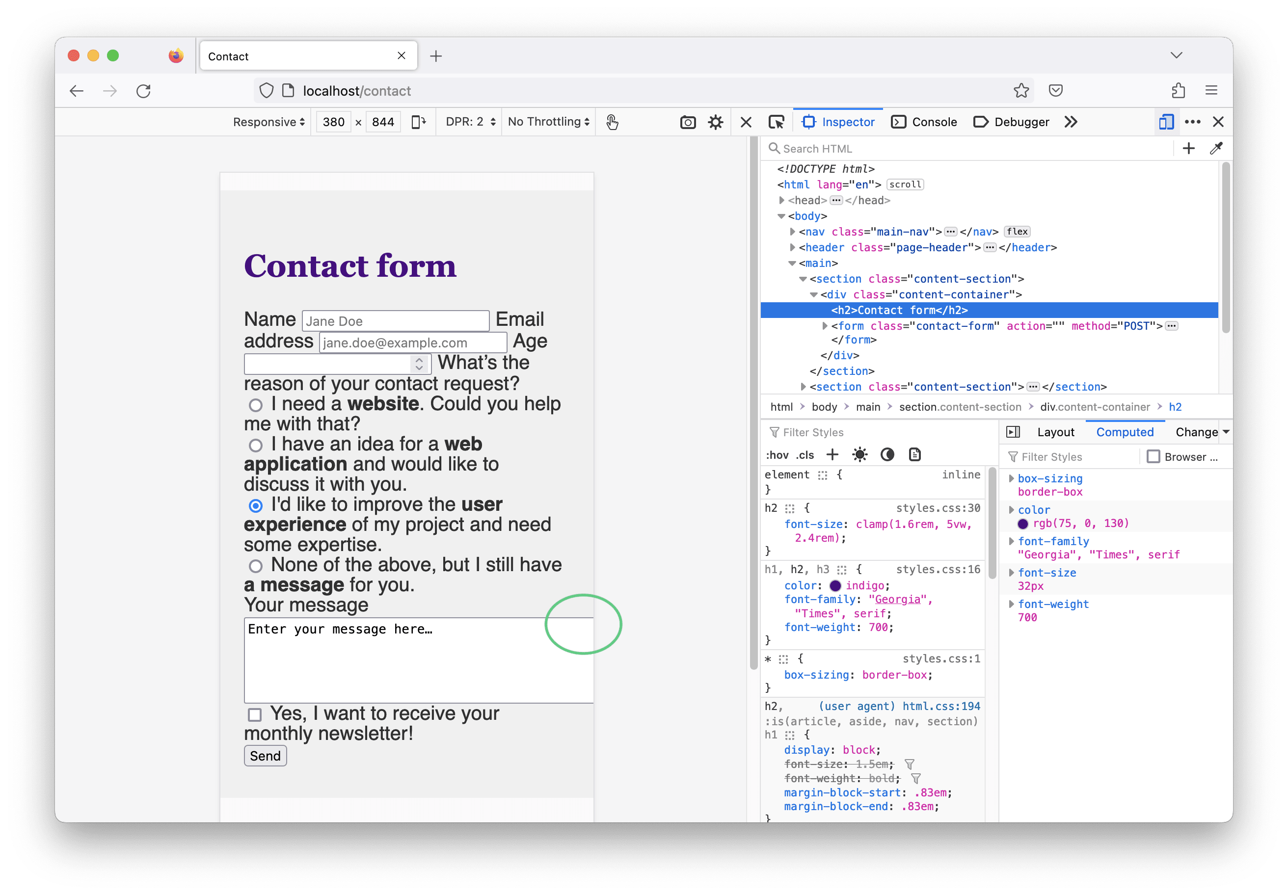
What we can see in the screenshot above is that now all labels and input elements sit in one line, because they are inline elements (and we’ve removed the wrapping div containers which are block elements). We can also spot an overflow problem with the text area that makes our page horizontally scrollable, which is something we should try to avoid. The reason is that we set the cols attribute of the <textarea> to 50. Once removed, the page looks better. 🙂
Now I want most of my labels and input elements to sit in their own line (except the ones of the checkbox and radio elements) according to the wireframe. I could start making block elements out of inline elements using display: block and fiddle around until I get the expected result, but I have another idea… 💡
I add class="contact-form" to the form tag and use this as selector in my CSS:
.contact-form {
  display: grid;
  gap: 8px;
}
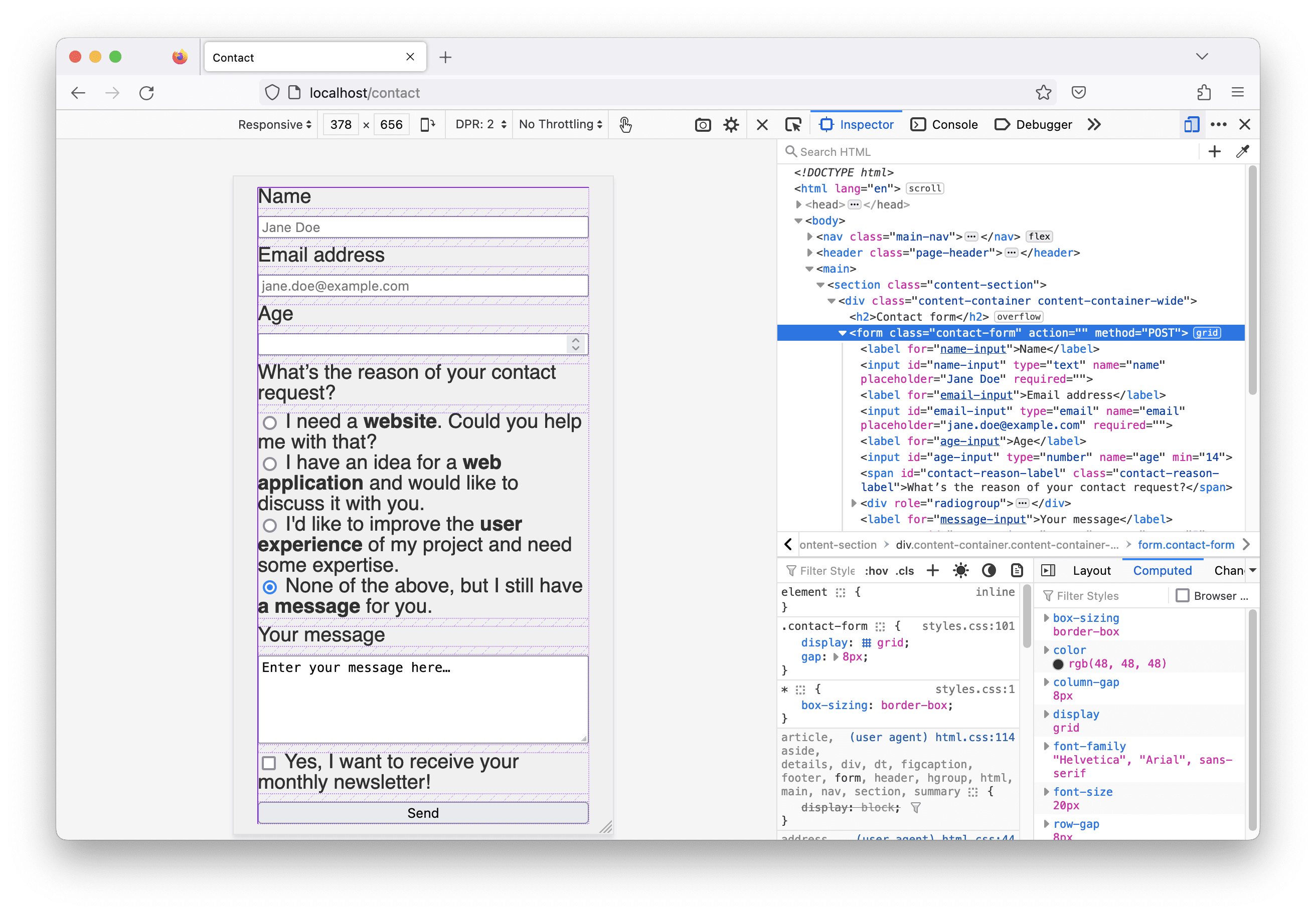
What happens now is that the form becomes a grid container and all its direct children turn into grid items. Because I didn’t specify anything else, the grid consists of one column, each item creates an implicit grid row and between the rows is a gap of 8px (we already know this property from flexbox). Have a look in the browser and see that we’re a huge step closer to the desired single column design! 🎉 In the screenshot below the grid inspector is turned on, and you can see the CSS grid in action.
Spacing and color adjustments
A few spacing and design adjustments are still missing:
- increasing the line height
- increasing the distance between one input field and the next
- choosing a different color and font for the labels
I’d like to have a slightly increased line height to make the labels of the radio group better readable, so I update my code as follows:
.contact-form {
  display: grid;
  gap: 8px;
  line-height: 1.3;
}
To separate one input field from the next, we need to increase the space between an input and the label of the next one, so that a label and its associated input field are visually grouped. I can’t just select all the label elements in the form, because I don’t want to change the labels of the radios and the checkbox or the first label on top. We also have custom labels and wrappers in our grid. Therefore, I make the following changes to my HTML code:
<!-- adding a class for styling to the contact reason label -->
<div id="contact-reason-label" class="contact-reason-label">What’s the reason of your contact request?</div>

<!-- adding a class to the checkbox wrapper -->
<div class="newsletter-subscription">
  <!-- newsletter checkbox here -->
</div>
The following code snippet shows the CSS code for the adjusted spacing.
.contact-form > label:not(:first-child),
.contact-reason-label,
.newsletter-subscription,
.contact-form [type="submit"] {
  margin-block-start: 16px;
}
Now each input is clearly separated from its siblings by applying the law of proximiy.
Last but not least, I’d like to style the labels differently. Let’s update the CSS code as follows:
.contact-form > label,
.contact-reason-label {
  font-family: "Georgia", "Times", serif;
  color: indigo;
}
For now, I’m happy 😊—let’s dig a little deeper into CSS grid layout and its features!
Building the two column layout
As shown in the wireframe above, there should be a two column layout for the form on larger screens. To define explicit grid columns we can use the grid-template-columns property. I hope, you remember the last article? In order to activate styles on specific screen sizes only, we can use CSS media queries, so here’s what I’m going to do:
@media screen and (min-width: 800px) {
  .contact-form {
    grid-template-columns: 1fr 2fr;
  }
}
Hey, there’s a new CSS length unit: fr, which stands for fraction. In our example, the browser calculates the available space for the contact form and divides it by three. One part goes to the first column and two to the second one, so the second column takes up twice as much space as the first column. This is a great feature that saves us a lot of time calculating widths and media query breakpoints! 🧮
Similar to the text with image sections we’ve built last time, the content container’s width is too small for the two column layout. The solution: we add the content-container-wide class to the contact form’s content container and the page looks great again. Go to your browser and check it out!
There’s something that looks a bit off, though… The second and third input fields are larger than the first one and the contact request label is not aligned with the first radio item. The reason is the margin we’ve added before, so we need to reset it again here:
@media screen and (min-width: 800px) {
  .contact-form {
    grid-template-columns: 1fr 2fr;
    gap: 24px;
  }

  .contact-form > label:not(:first-child),
  .contact-reason-label,
  .newsletter-subscription,
  .contact-form [type="submit"] {
    margin-block-start: 0;
  }
}
I’ve also adjusted the gap property and set it to 24px, because I want the content to have more space on larger viewport sizes. In a two column layout this is a shorthand for column-gap and row-gap, which means the spacing is adjusted in both directions.
Defining a grid item’s position
According to the wireframe, the checkbox for the newsletter subscription should be positioned directly below the textarea. By default, the grid algorithm fills the empty cells one by one with the items as they are sorted in the HTML code. We can change that by defining an explicit position for the item, for example by adding the desired starting line number.
The following screenshot shows the line numbers of the grid when the grid inspector is activated. Maybe you need to activate this feature in the Firefox developer tool’s layout section first.
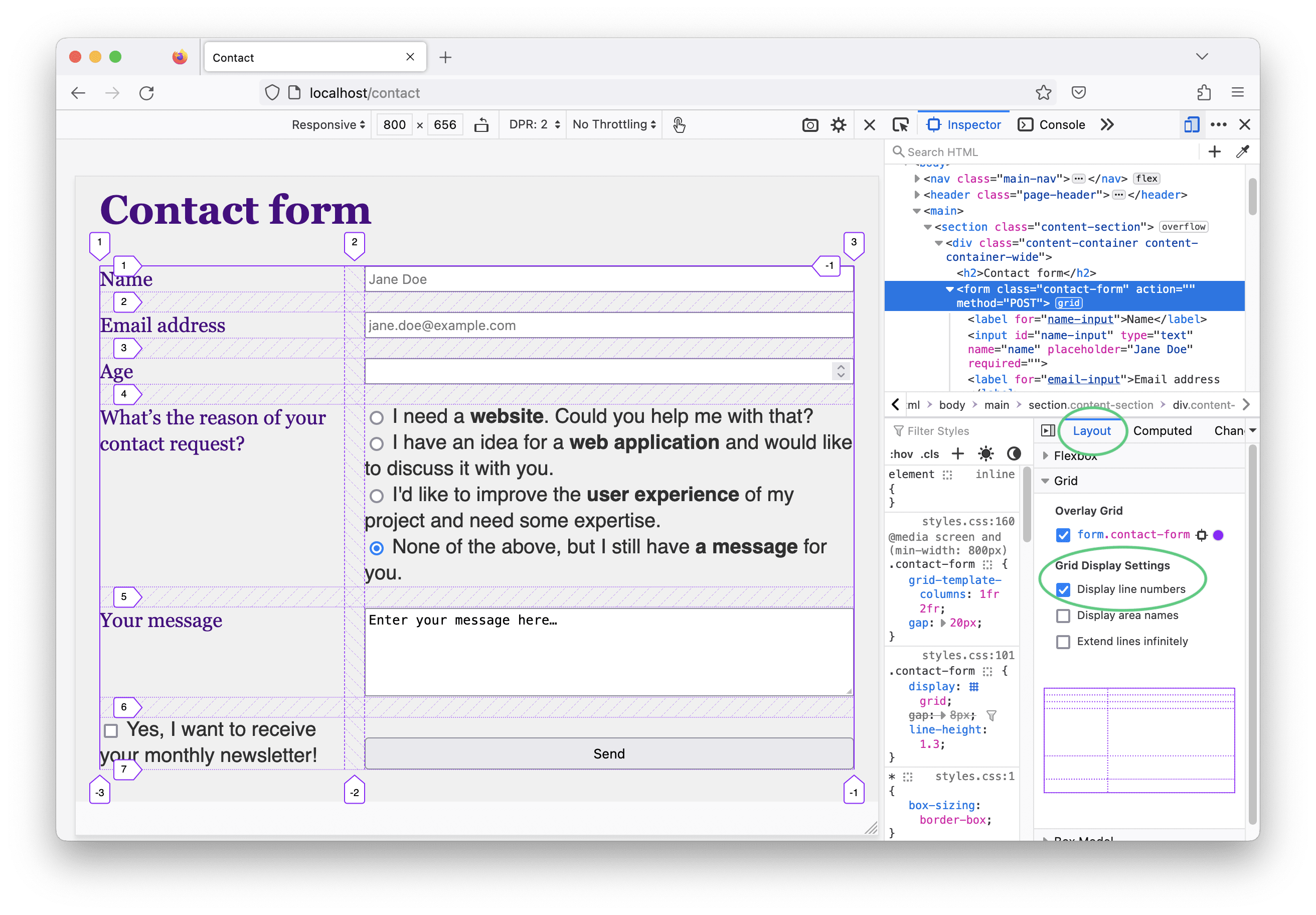
We want the newsletter checkbox to go from the vertical line 2 to line 3. This is how we write this in CSS:
.newsletter-subscription {
  grid-column-start: 2;
}
We only need to define the start, because the item spans one column by default and that’s our desired goal.
The last question: how do we center the button at the bottom of the two column form? The answer in CSS:
.contact-form [type="submit"] {
  grid-column: 1 / span 2;
  justify-self: center;
}
The first line defines the item’s position by setting the starting line and the amount of columns it should span, separated by a slash. Additionally, we need to adjust the item’s justification, which is the horizontal alignment within a grid cell. By default this value is set to stretch which makes the button span the entire row.
Looks like we’ve built an HTML form layout with CSS grid as defined by the wireframes above! 🎉
CSS grid takeaways
Here’s a summary of the features about CSS grid we’ve heard about in this article:
- When adding
display: gridto an HTML element, the element itself becomes the grid container and its direct children become grid items. - The CSS grid layout algorithm implicitly creates one grid column and one row for each child when not specified otherwise.
- Using the
grid-template-columnsproperty you can define the desired number and size of the columns. - The
gapproperty is a shorthand forrow-gapandcolumn-gapand defines the space between rows and columns. - By default, each grid item is placed in the next free grid cell.
- Using
grid-column-start(orgrid-row-start) you can define the starting position of a specific grid item. - The
grid-columnproperty let’s you define the start line and, separated by a slash, the amount of columns the item should span across. - By default, the grid items are stretched within their available space. The
justify-selfand thealign-selfproperties can be used to change this for single grid items in horizontal and vertical direction, respectively. (Usejustify-itemsandalign-itemson the grid container when you want to change the behavior for all children.)
Obviously, we’re only scratching the surface here. CSS grid is much more powerful.
There are many articles and tutorials about the inner workings of CSS grid out there. Here are some of my favorites and good places to start when you want to learn more:
- CSS Grid Layout on MDN: an introduction with many continuing links
- A complete guide to CSS Grid on CSS Tricks: check it out when you want to have an overview about all grid related CSS properties for the container and the items
- Grid by Example by Rachel Andrew: guides and (video) tutorials—everything you need to know about CSS Grid
Keep in mind that the HTML code structure is an important basis for building layouts. It can happen that you start writing HTML code and once you add styles, you need to update the markup again and again in order to work with the CSS algorithms you choose. This is perfectly fine and part of the development process.
Bonus: Input and button styles
We can use our CSS knowledge and update the styles of the interactive elements in the form—inputs and buttons—and adjust it to the look and feel of the rest of the site. It’s mostly about updating spacing, borders, colors, and font sizes.
This is my code. Feel free to play around with the different CSS properties and find styles that you like and work with your design! 🎨
/* Increase the spacing between the radio controls. */
[role="radiogroup"] > div + div {
  margin-top: 8px;
}

/* Styles for the input fields and the textarea. */
.contact-form input,
.contact-form textarea {
  font-size: 0.875rem;
  font-family: "Helvetica", "Arial", sans-serif;
  padding: 8px 12px;
  border-radius: 4px;
  border: 2px solid lightgray;
}

.contact-form input:hover,
.contact-form textarea:hover {
  border-color: darkmagenta;
}

/* Styles for the submit button. */
.contact-form [type="submit"] {
  border-radius: 4px;
  border-color: indigo;
  background-color: indigo;
  color: #ffffff;
  padding: 8px 16px;
  min-width: 100px;
  font-weight: 700;
}

.contact-form [type="submit"]:hover {
  background-color: darkmagenta;
  border-color: darkmagenta;
}
Accent color
The default color of elements like radios and checkboxes is blue in most browsers. Using the CSS property accent-color, which is supported in all modern browsers, you can update the color to match your design.
.contact-form {
  accent-color: indigo;
}
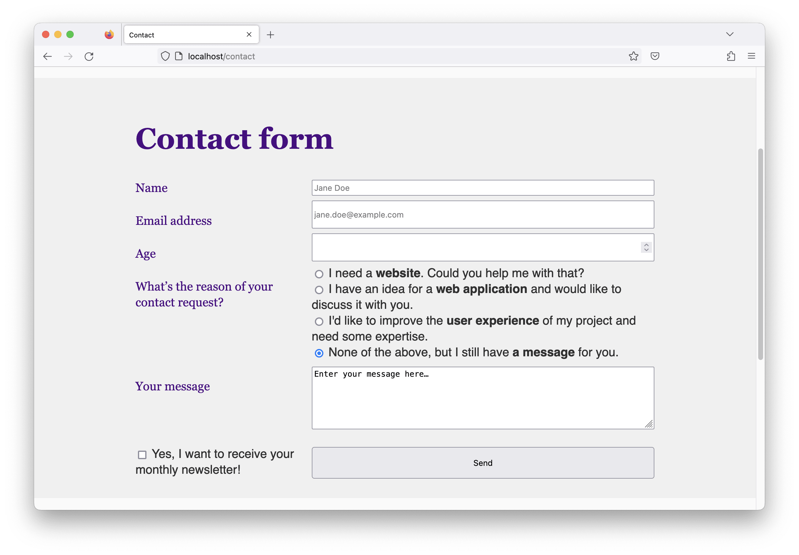
And we’re done! Here’s a final screenshot of the contact form in Firefox.

Now we’ve made our tiny website fully responsive, there’s one more related topic I’d like to talk about in the next article: responsive images using HTML—stay tuned! 😊